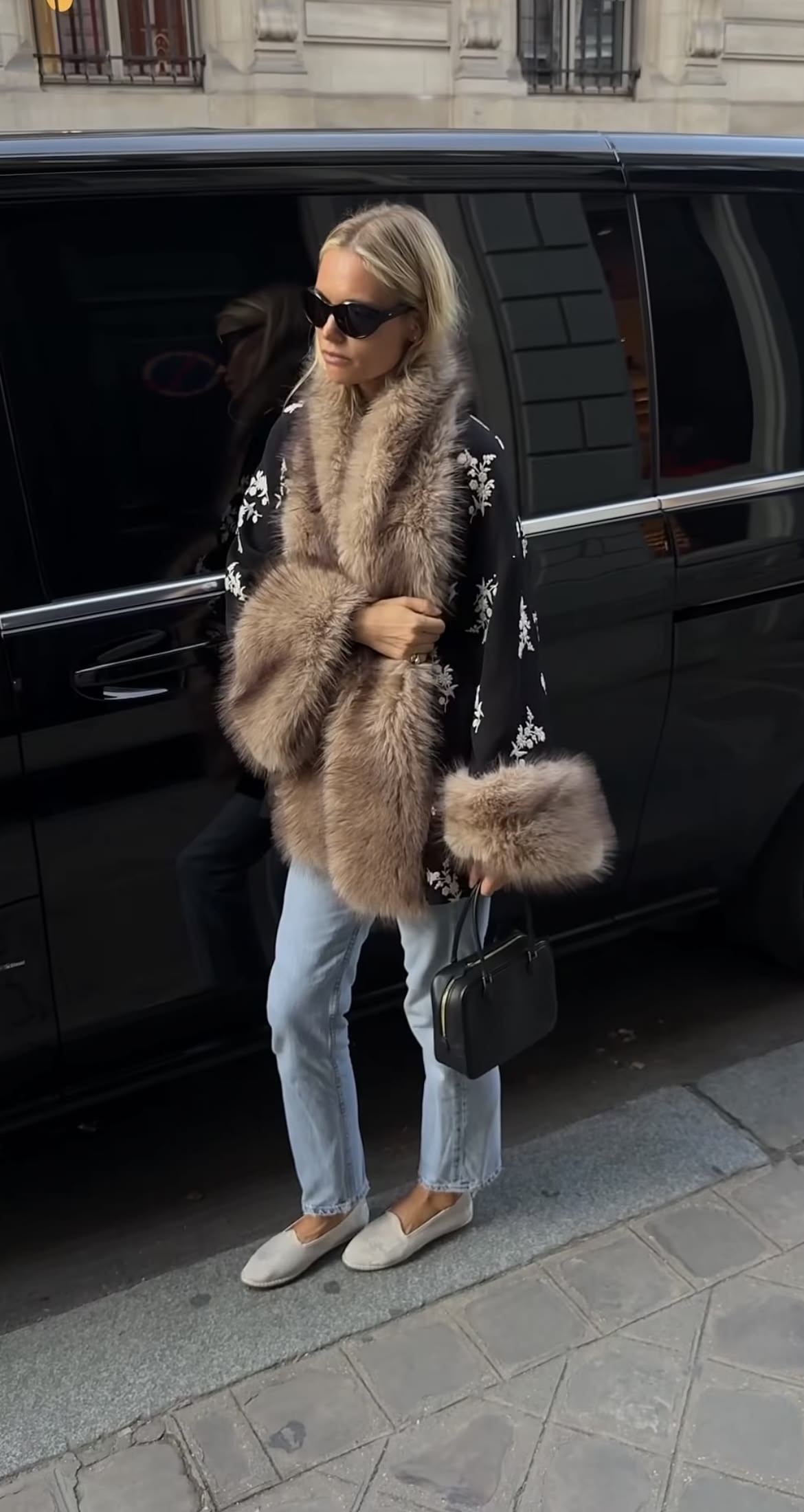
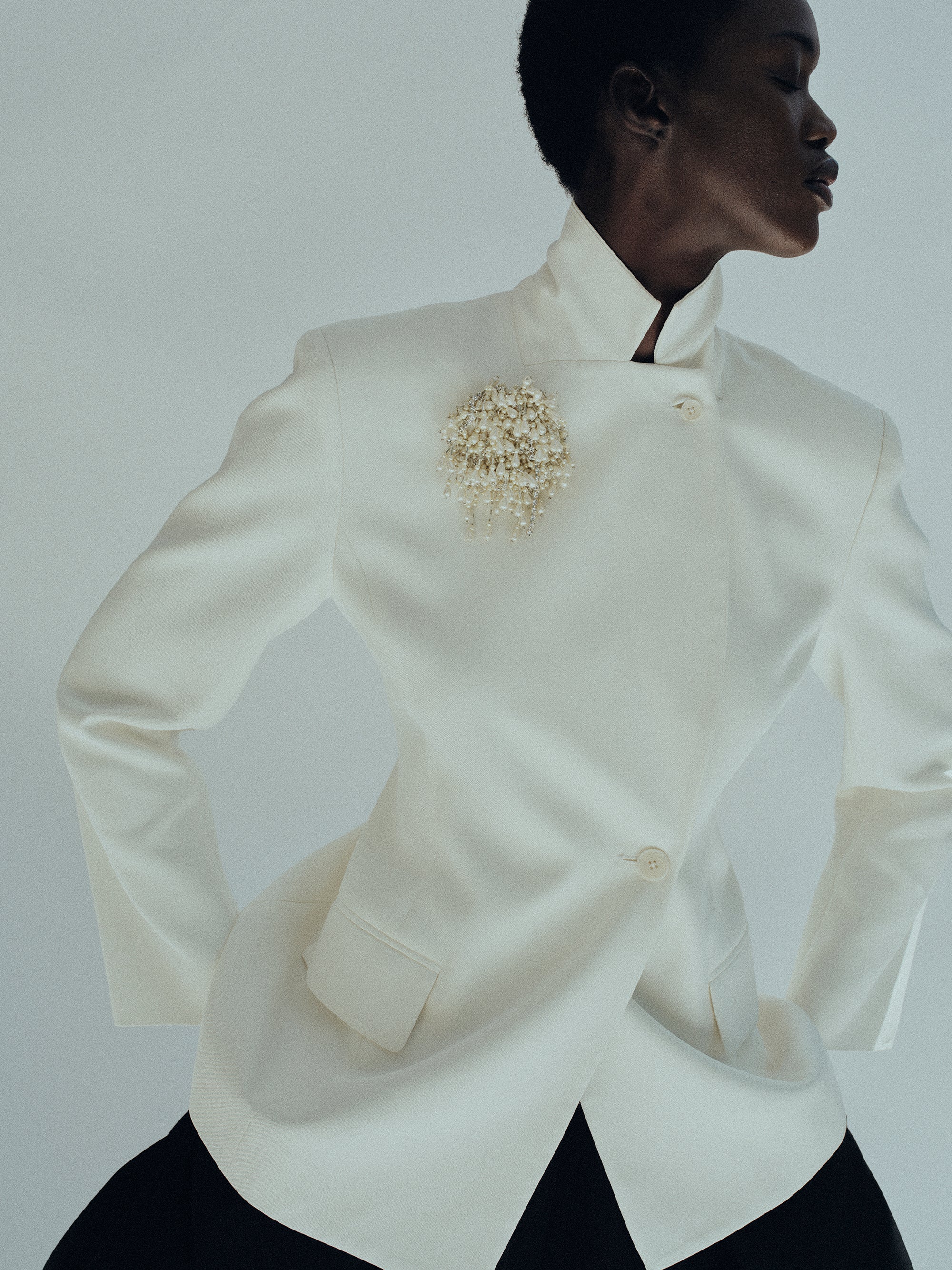
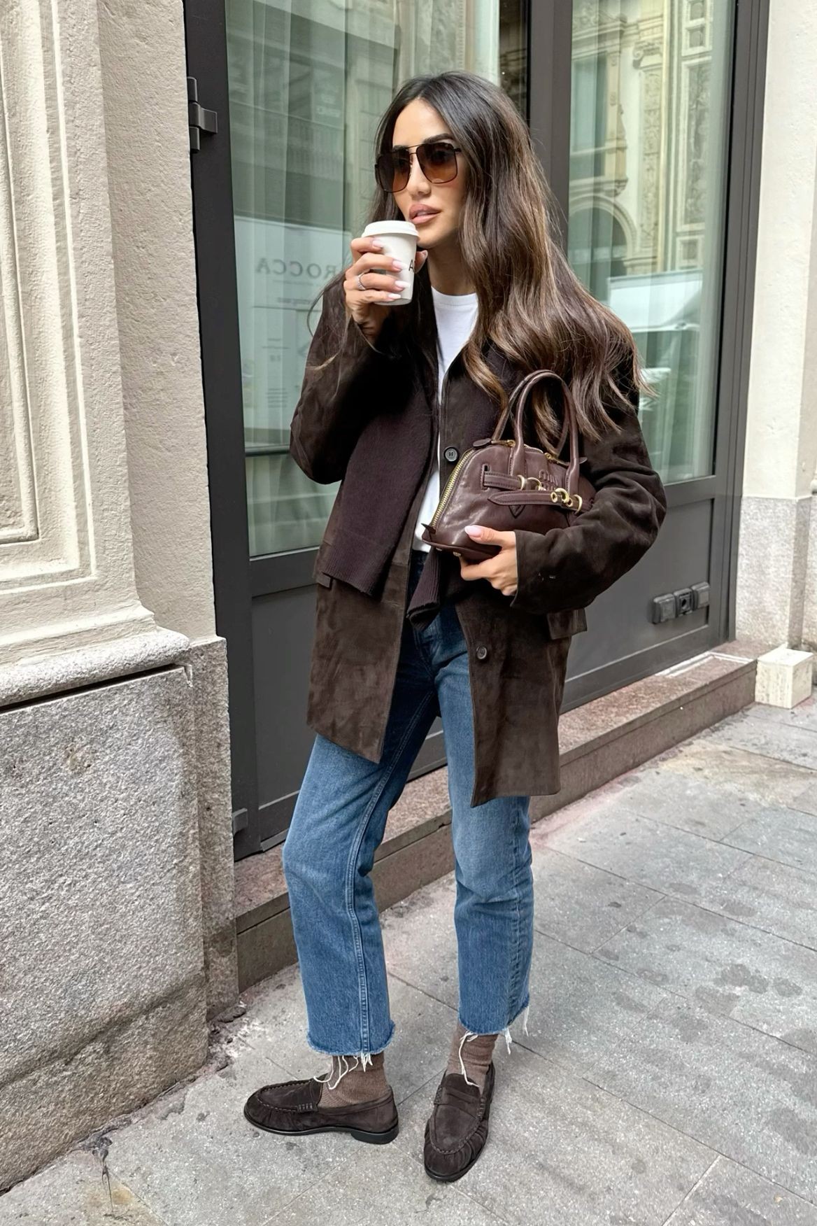
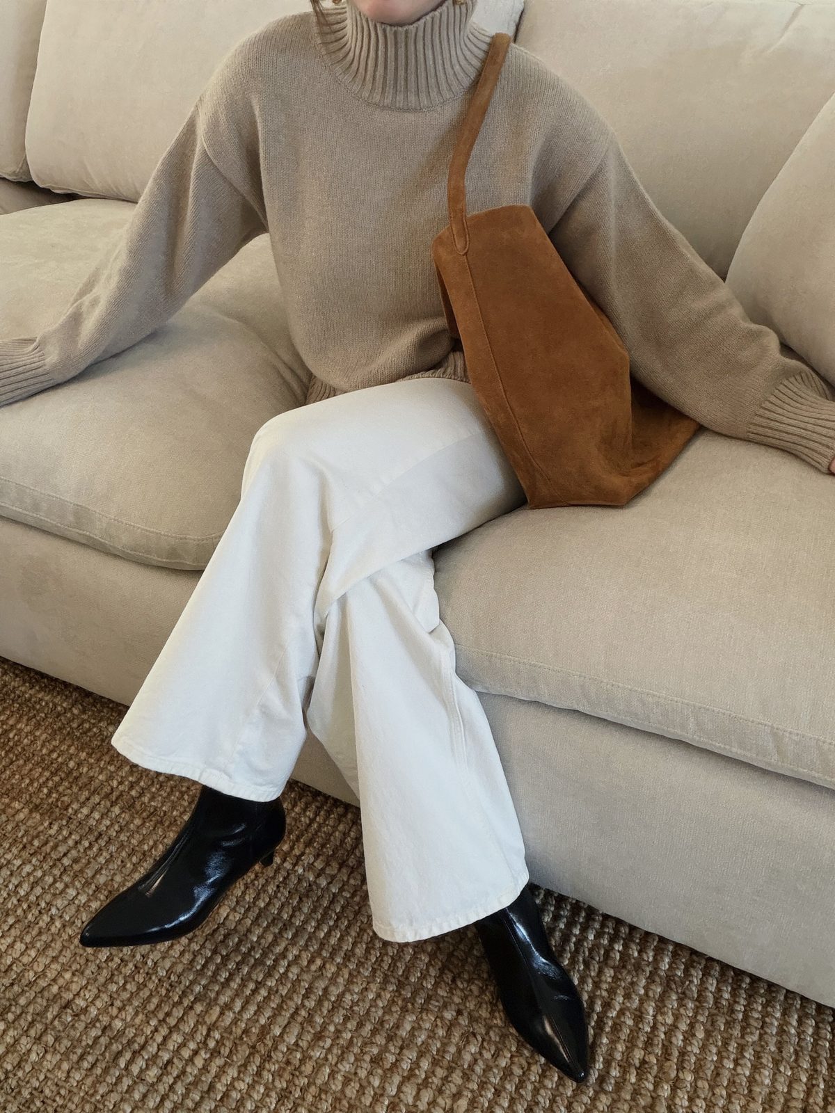
A blue scarf can bring a clean color note to an outfit, whether you want a small accent or a softer layer. I choose its scale and texture to suit the day rather than matching every piece around it.
Blue Scarf: Pairings, Proportions and Finishing Touches
A Clear Blue Accent
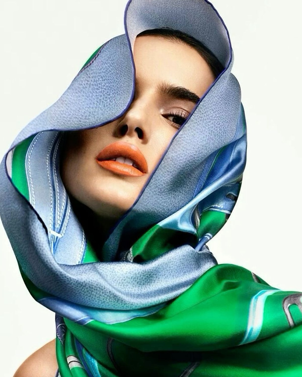
A blue scarf is one of my favorite ways to add color without asking the rest of an outfit to change. The shade can feel crisp against a neutral coat, relaxed with denim, or more deliberate beside another quiet color. I start with scale: a narrow scarf gives a small point of interest, while a larger wrap becomes part of the silhouette. For a weekday commute, I like a simple knot that stays out of the way; for a weekend lunch, a loose drape can make an ordinary shirt feel more considered. If the scarf has a strong print, I would skip adding another busy pattern right beside it. A plain coat or top gives the color room to land. Think about how warm you want the layer to be, where you will wear it, and whether you want the scarf to be an accent or the thing people notice first. That choice makes a blue scarf feel personal rather than like an afterthought.
Shop Blue Scarf
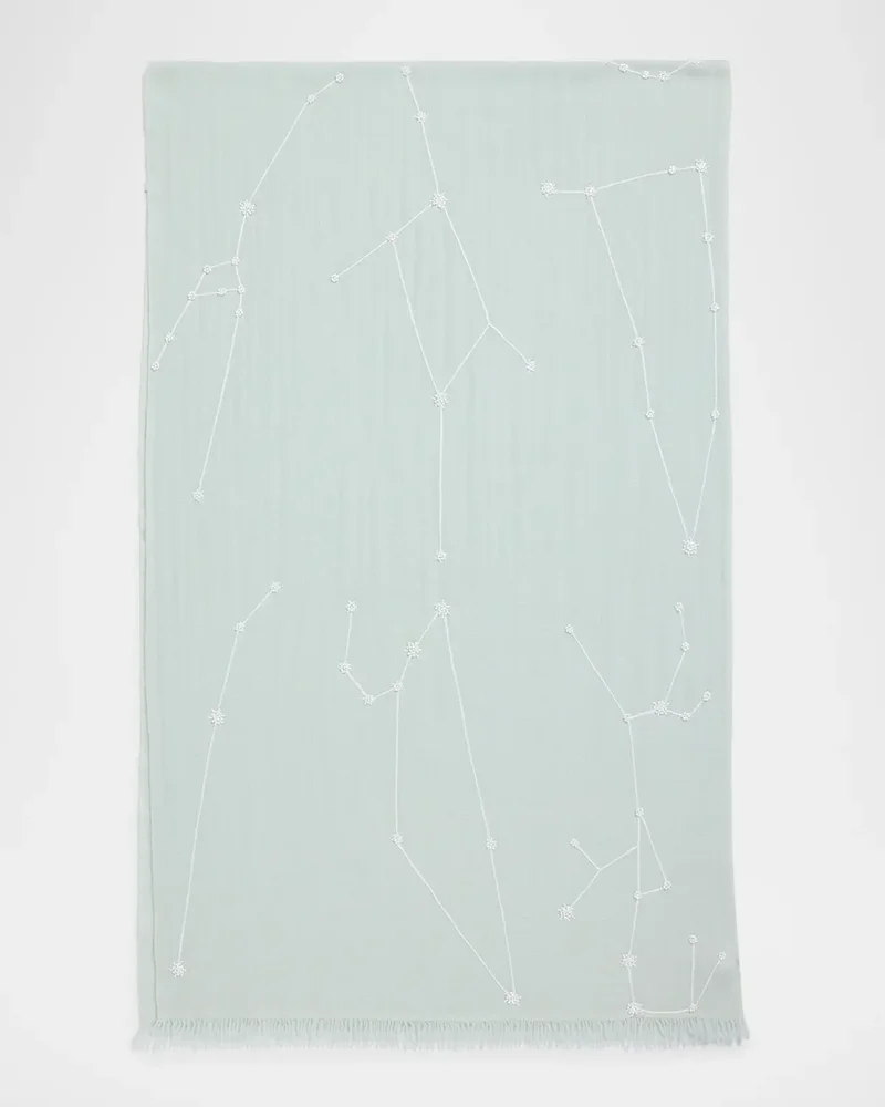
Beaded Constellation Cashmere/Wool Scarf
Carolyn Rowan
$435
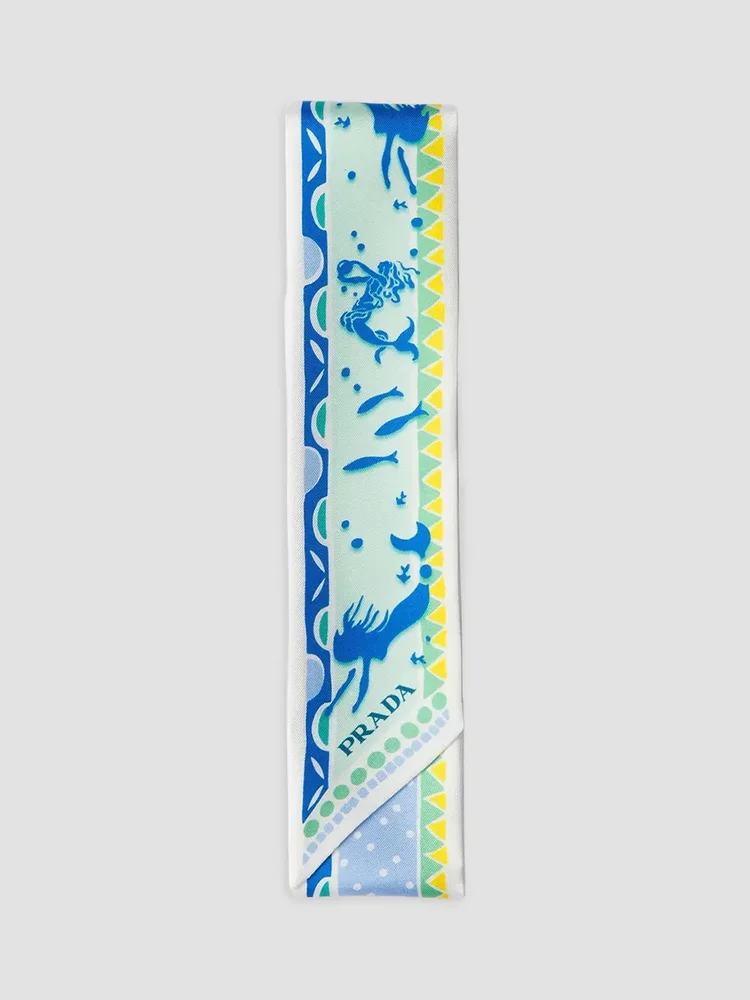
Printed Silk Twill Skinny Scarf
Prada
$295
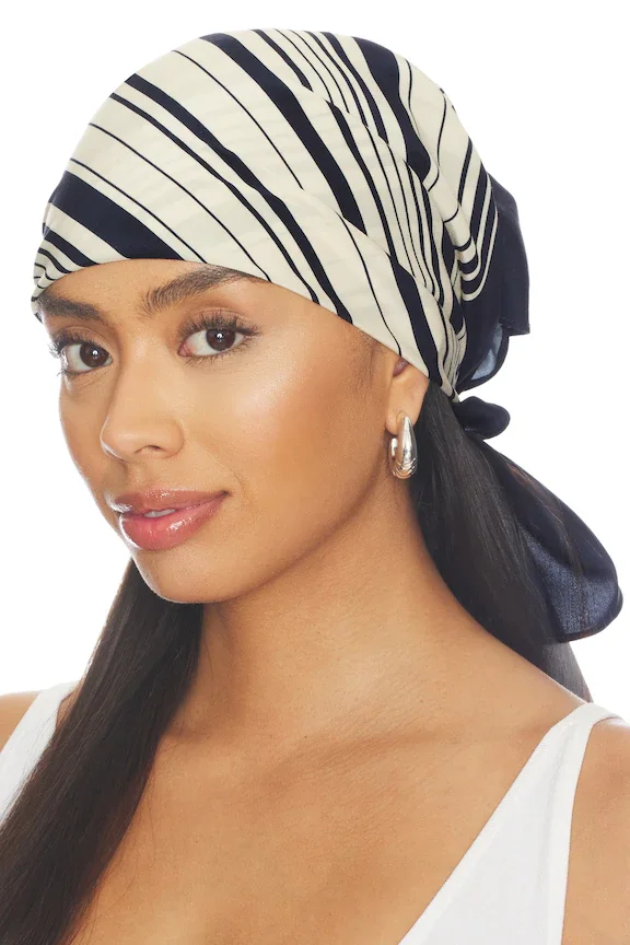
Carmel Scarf
Lovers And Friends
$25
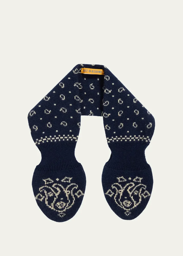
Bandana Bowtie Wool-Cashmere Scarf
Guest In Residence
$125
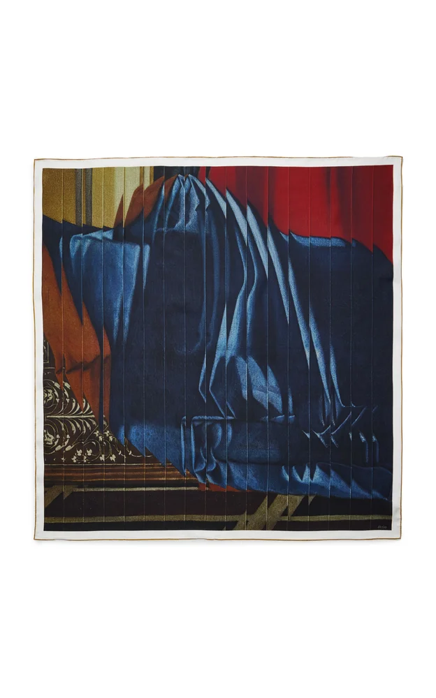
Bellini Silk Twill Scarf
Otzio
$305
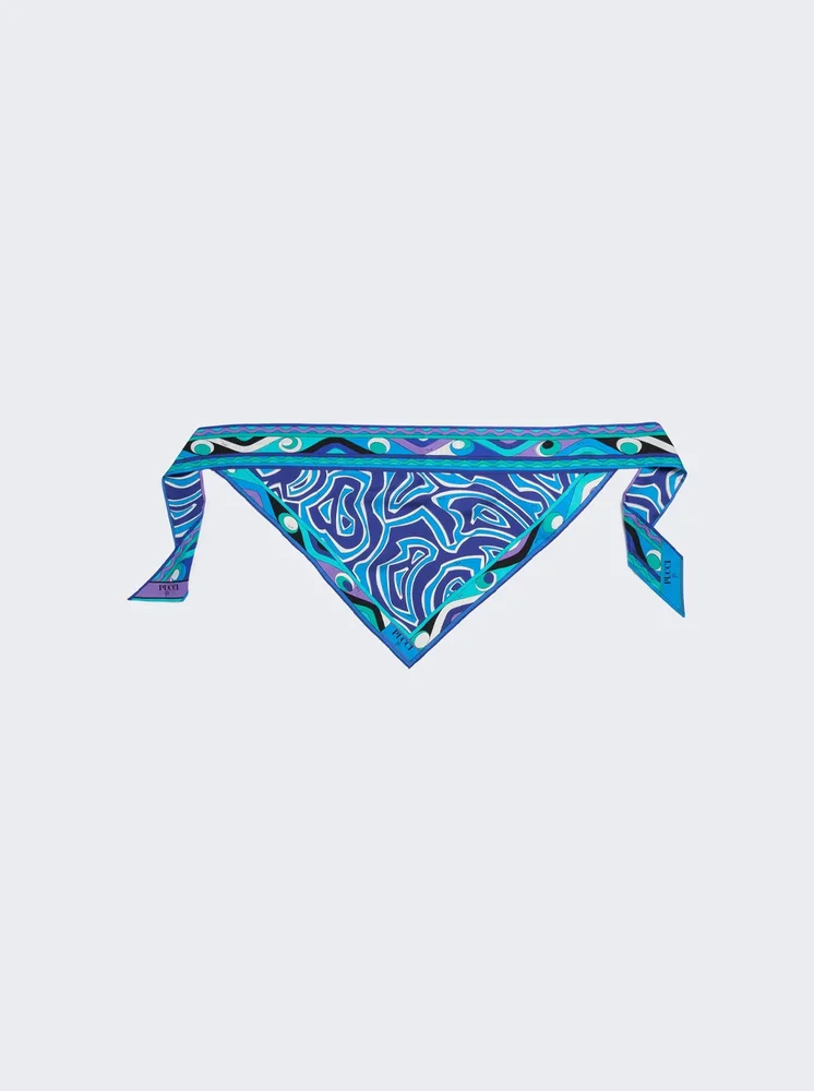
Labirinto Print Silk Triangle Scarf Turquoise
Pucci
$600
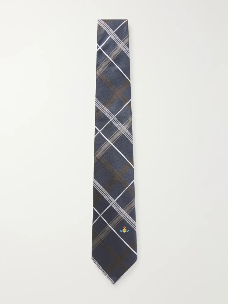
Checked-jacquard silk tie
Vivienne Westwood
$145
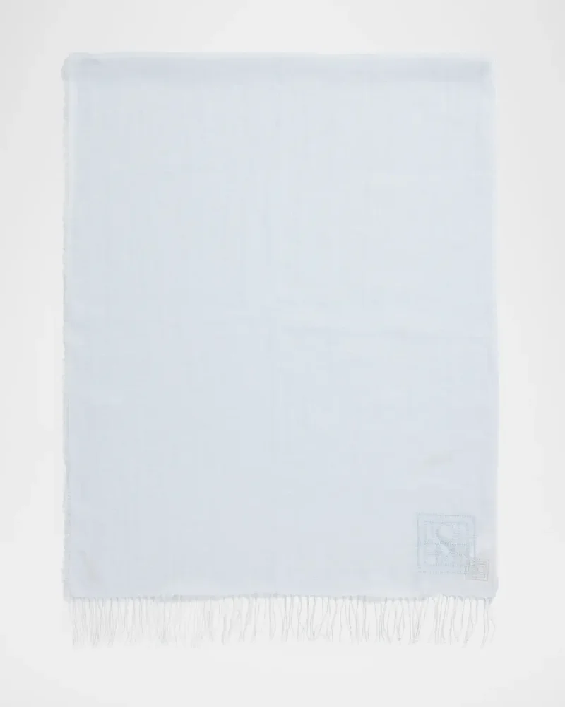
Linen Scarf
Toteme
$290
Pattern With Purpose
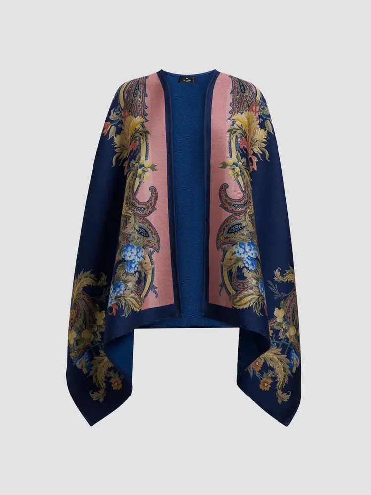
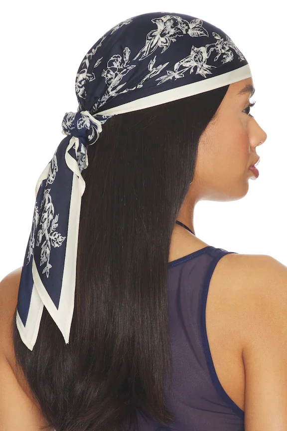
The selection has a mix of scarves and larger layers, so I would choose by how much coverage the day calls for. The Etro Paisley Wool-Blend Jacquard Cape makes a bigger statement in its named shape, while the Lovers And Friends Emma Triangle Scarf keeps the format smaller. The Pucci Mixed Print Silk Twill Bandeau Scarf Light Blue gives a lighter blue cue, and the Ferragamo Printed Silk Scarf offers another printed option. A blue scarf can sit neatly with a plain shirt or coat when the pattern is already doing enough. For a day at work, I would keep the rest of the palette calm; for an outdoor lunch, a looser wrap may be more comfortable. What I would skip is pairing two competing prints right at the neckline. Choose one main pattern and let the rest of the outfit give it some space.
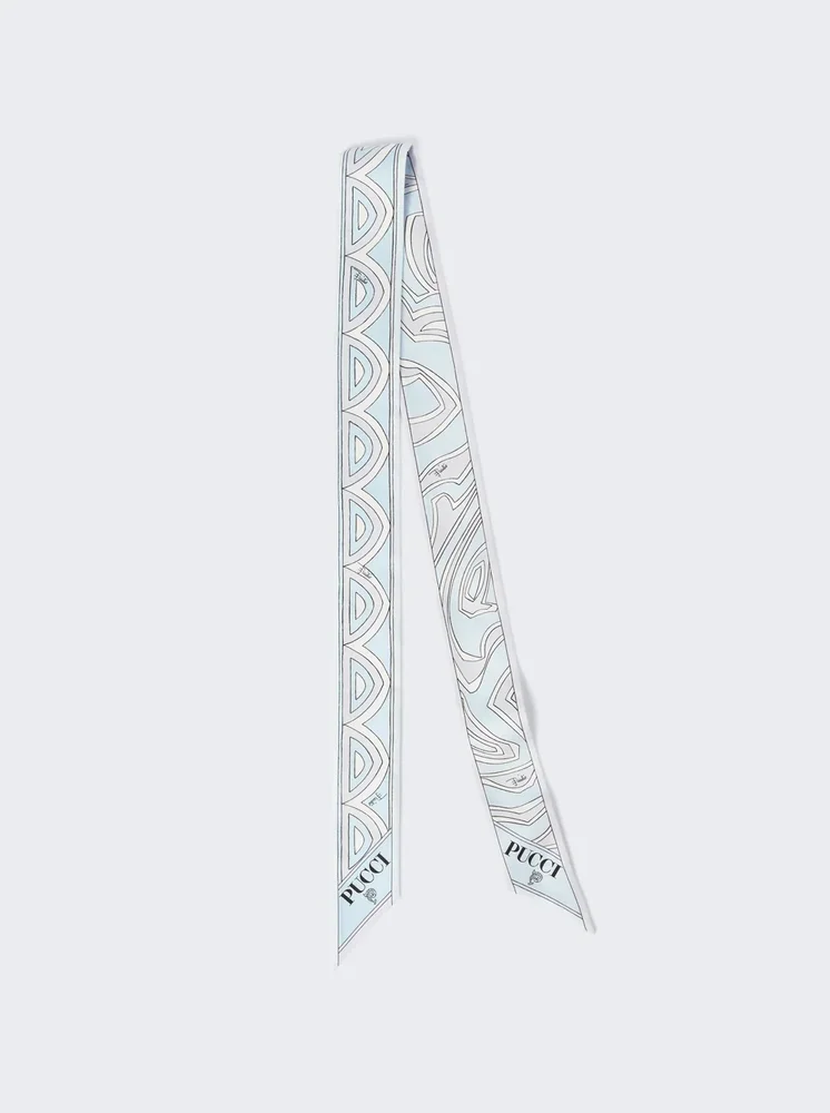
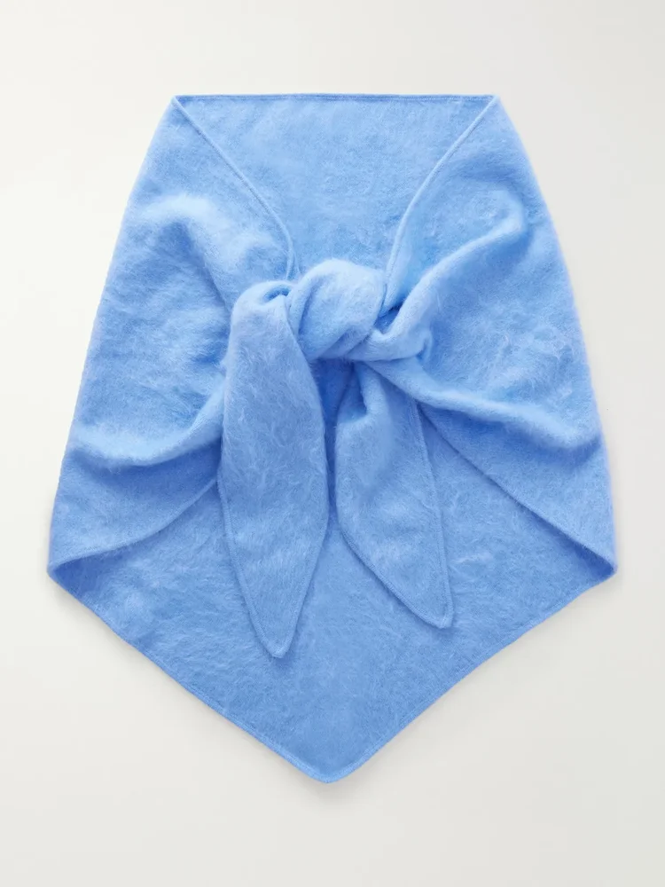
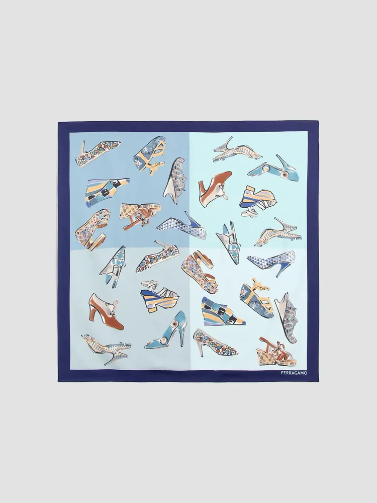
A Softer Layer
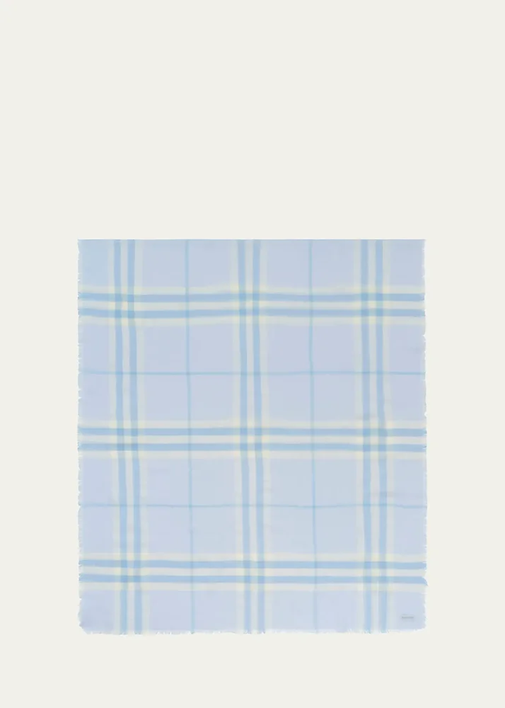
For a blue scarf that feels like part of the outfit rather than a small accessory, I would look at the larger wraps and the named cashmere pieces. The Burberry Giant Check Cashmere Scarf states both its pattern and material, while the Arch4 Cashmere and silk-blend wrap names a softer blend. The Pucci Onda and Iride Print Silk Scarf Light Blue makes light blue part of its description, and the Prada Wool and Mouliné Cashmere Scarf takes another material direction. I would use one over a simple coat for a chilly morning walk or a train ride, keeping the knot loose enough to move comfortably. If the scarf already brings a check or print, I would skip a patterned collar underneath. A plain sweater gives a softer layer a clear place in the look, and the color can do the talking without much else.
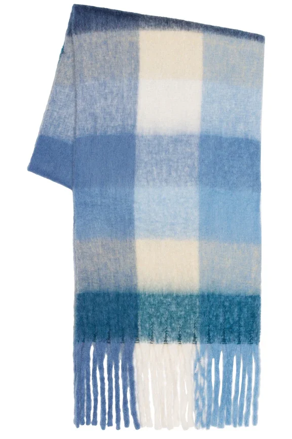
Highland Scarf
WellBeing + BeingWell
$98
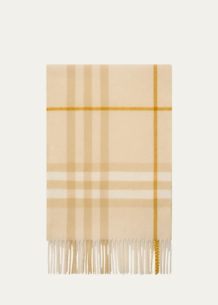
Giant Check Cashmere Scarf
Burberry
$675
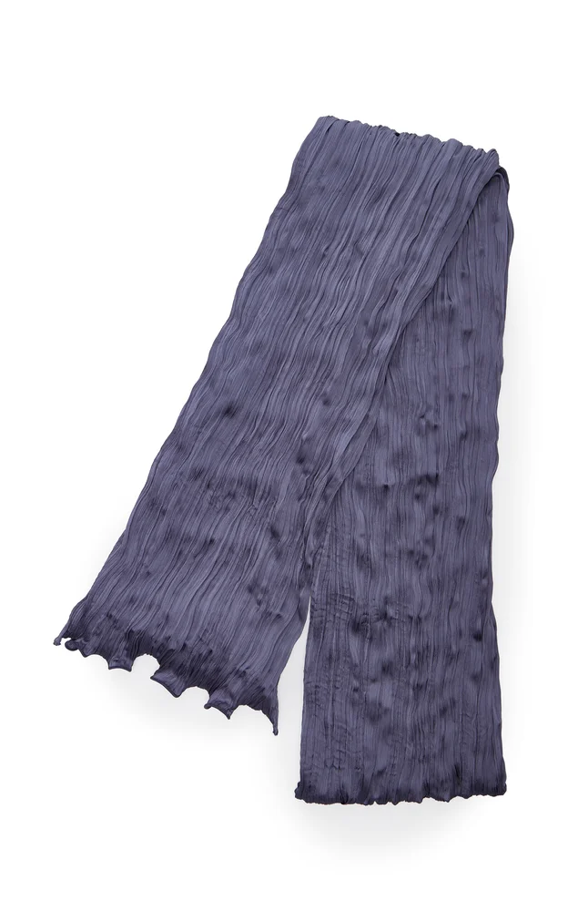
Esme Plisse Scarf
Posse
$190
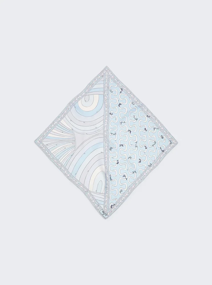
Onda and Iride Print Silk Scarf Light Blue
Pucci
$595
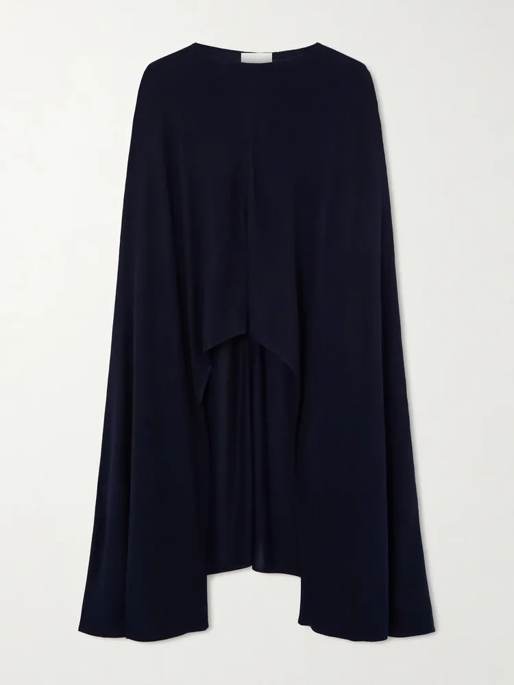
Cashmere and silk-blend wrap
Arch4
$625
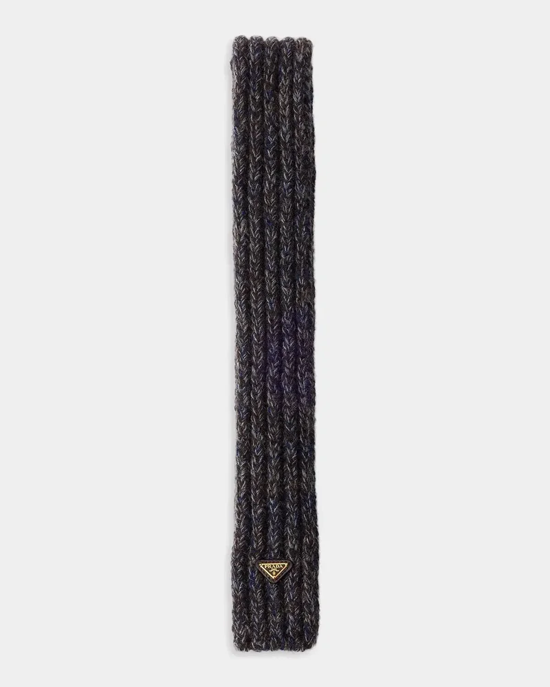
Wool and Mouliné Cashmere Scarf
Prada
$440
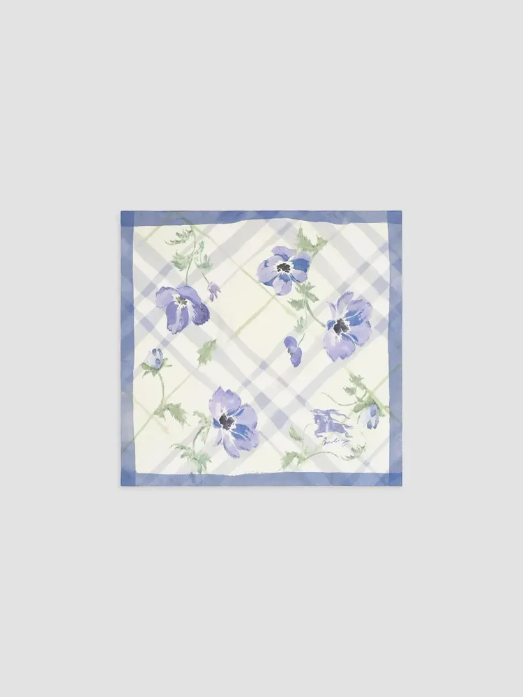
Check Watercolor Silk Scarf
Burberry
$555
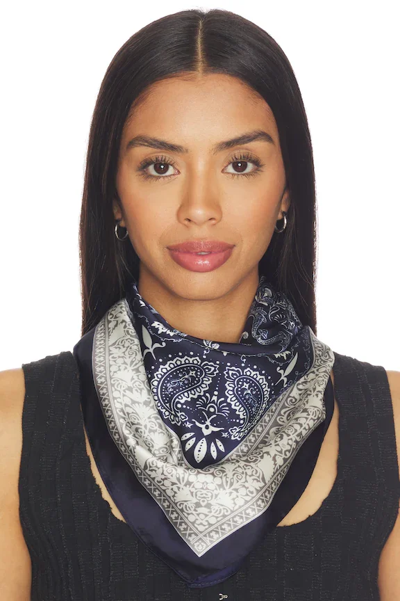
Juliana Scarf
Lovers And Friends
$30
More Ways To Tie
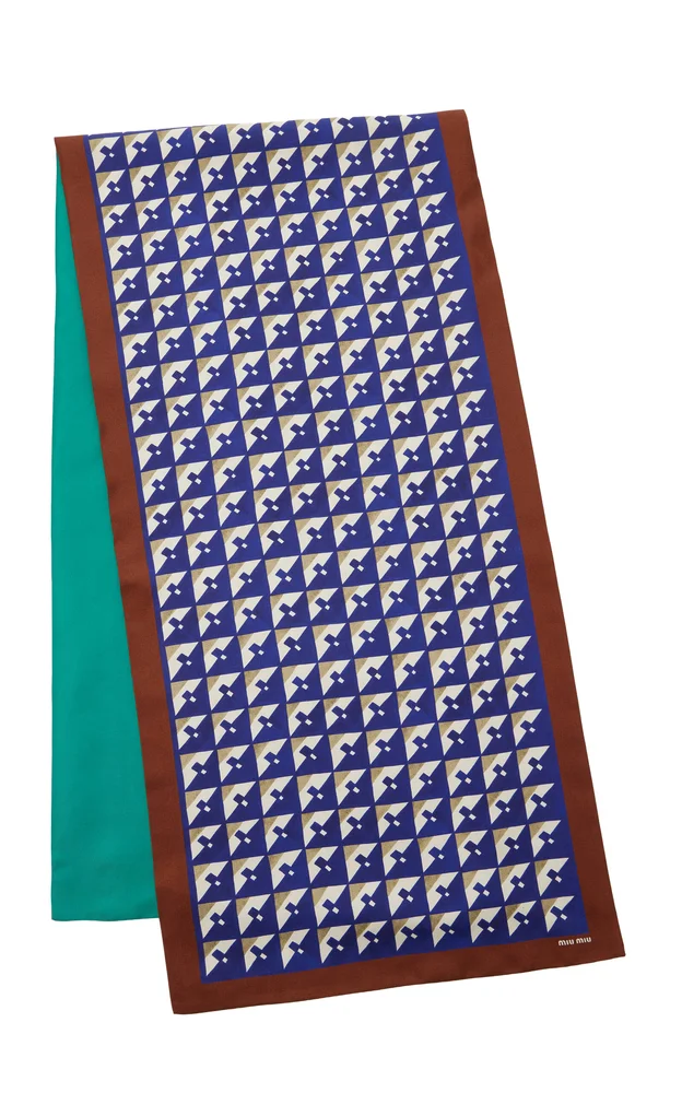
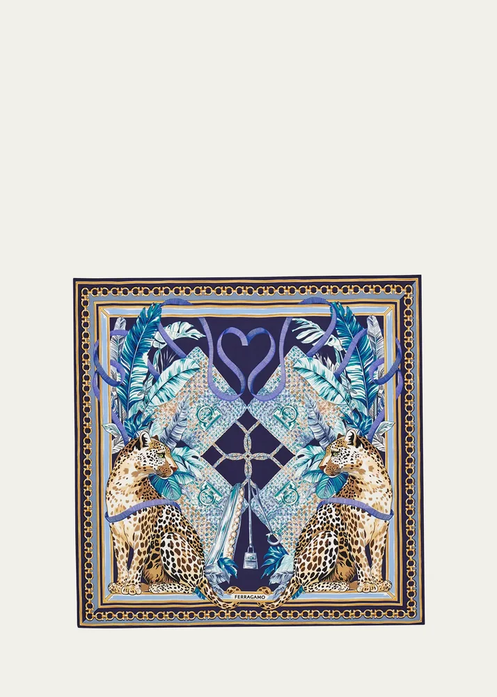
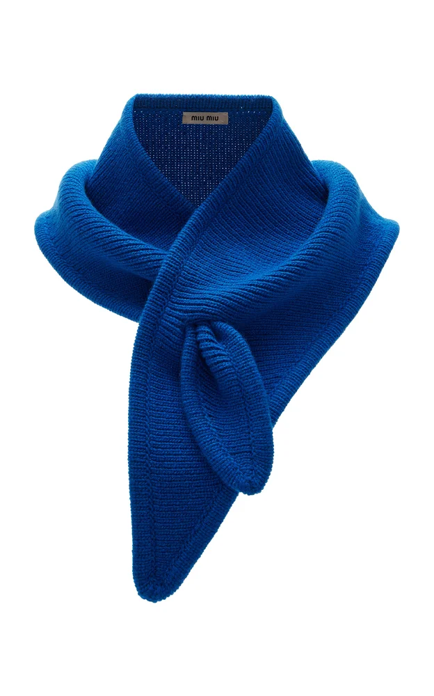
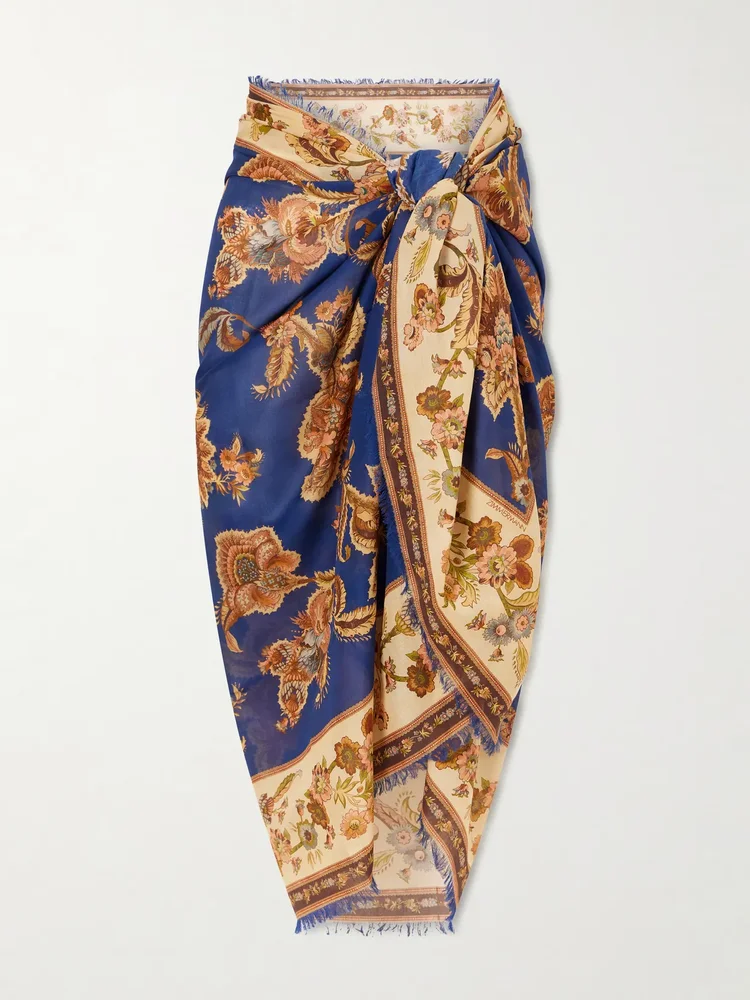
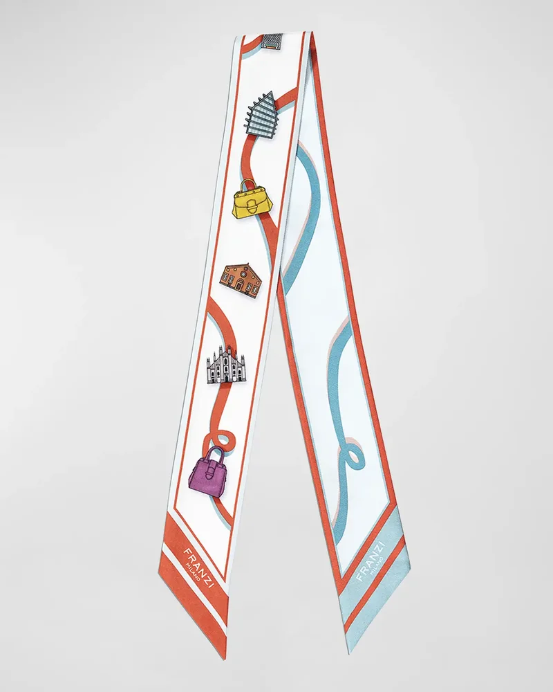
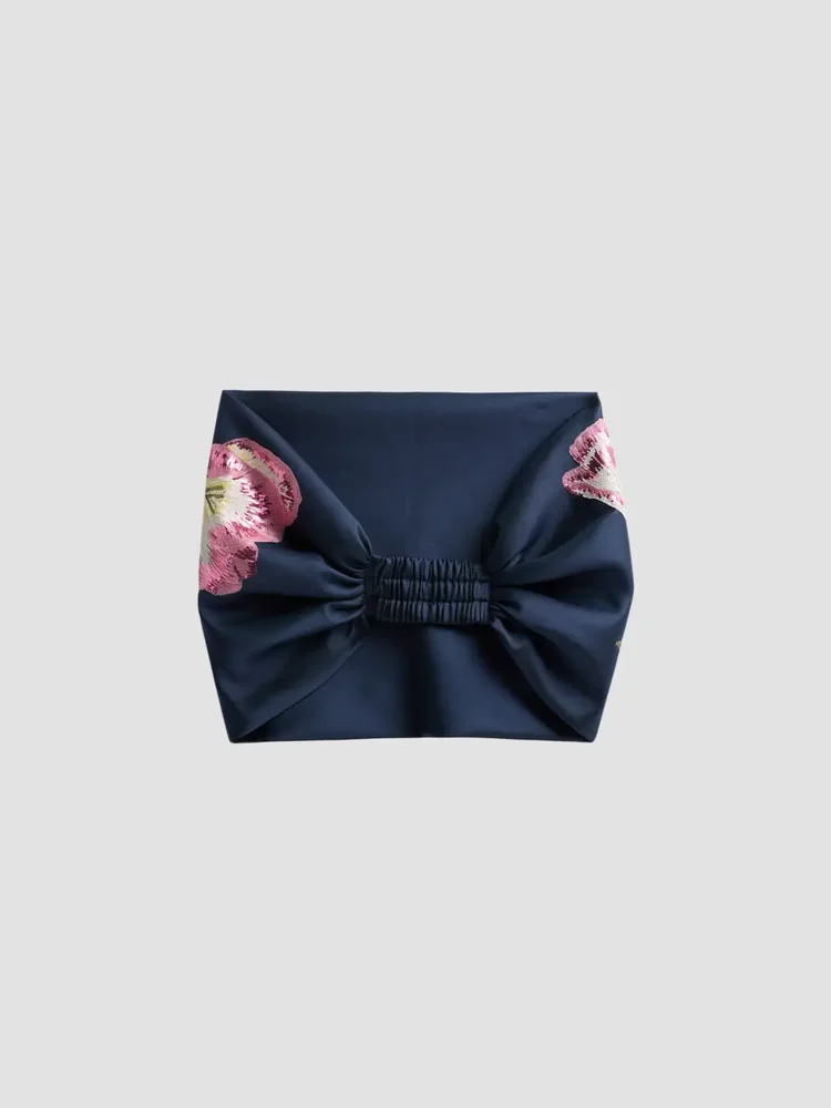
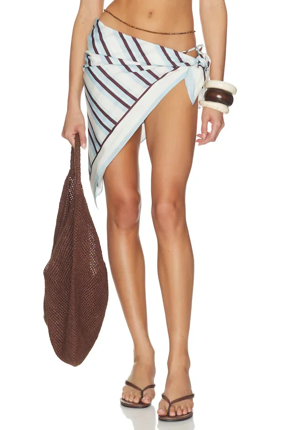
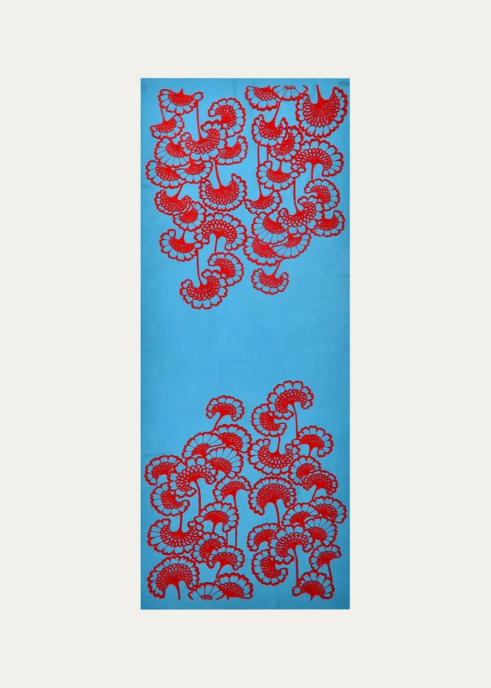
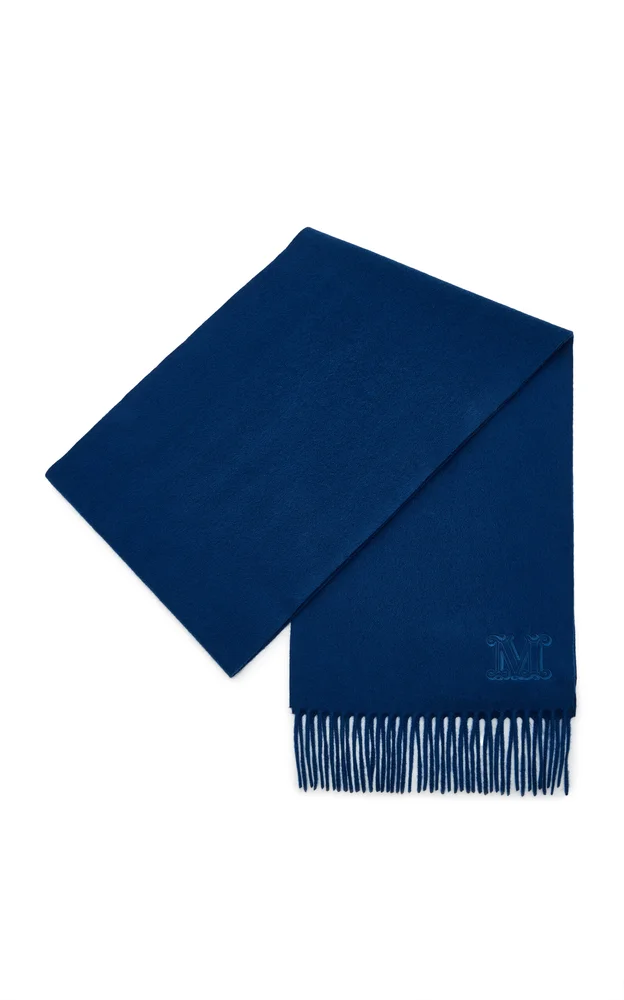
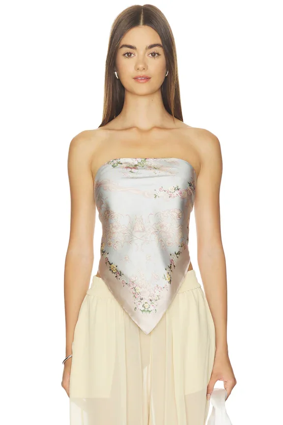
This group makes it easy to think beyond the standard neck knot. The Ferragamo Feline-Print Silk Foulard and the Franzi Printed Twill Silk Bandeau Scarf are both described as printed silk pieces, while the Zimmermann Frayed printed cotton pareo names a different shape and material. For a blue scarf look, I would keep the rest of the outfit understated and let the way you tie the piece change the mood. A foulard can feel polished for a client meeting, while a pareo can suit a beach day or a warm weekend plan. The Miu Miu Cashmere-Wool Scarf offers a different material note for a cooler day. I would skip adding another statement near the face if the scarf is the focal point. Pick the tying style that feels comfortable, then let the rest stay simple.
Beyond The Neck
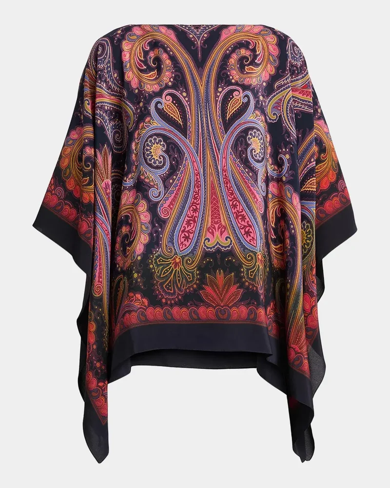
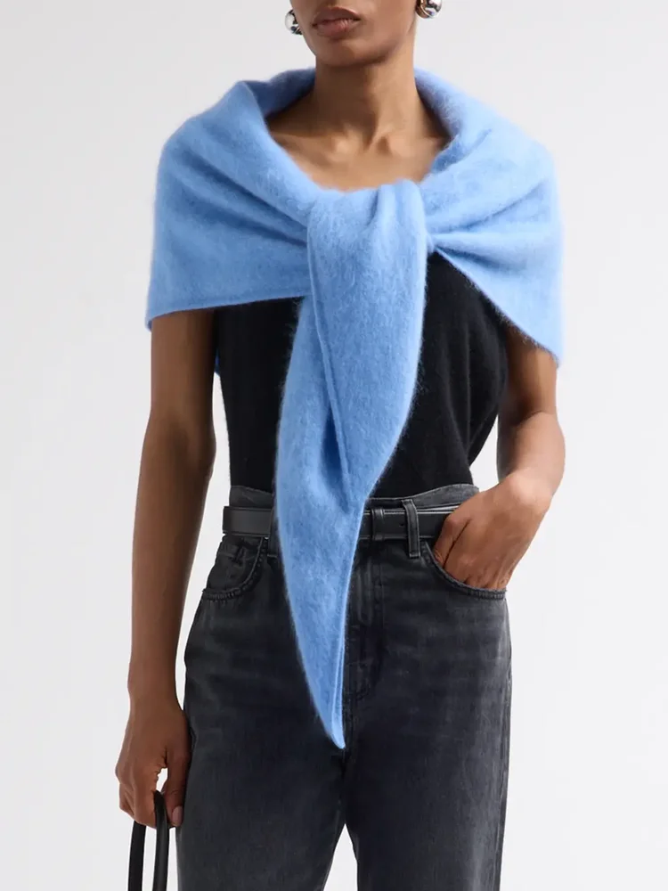
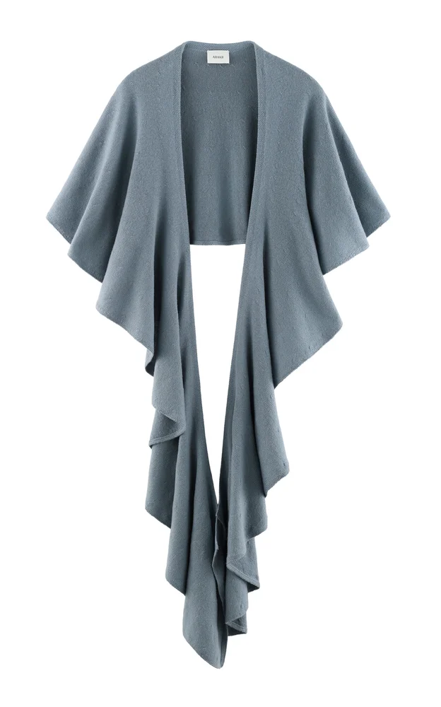
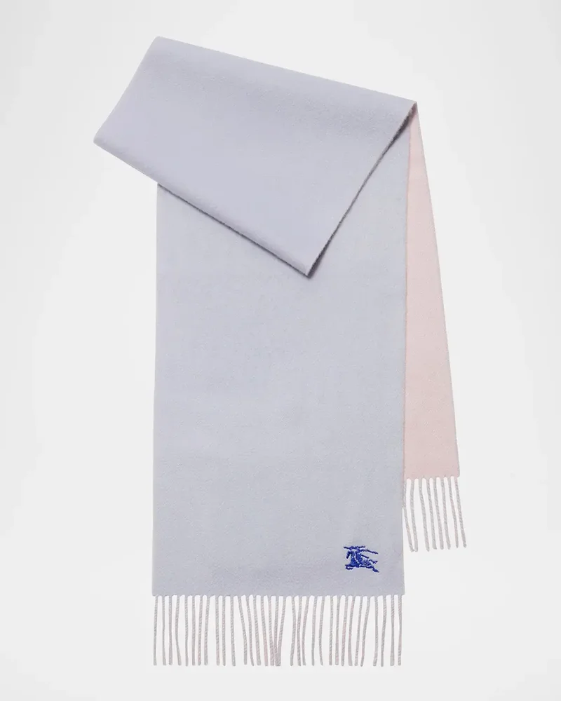
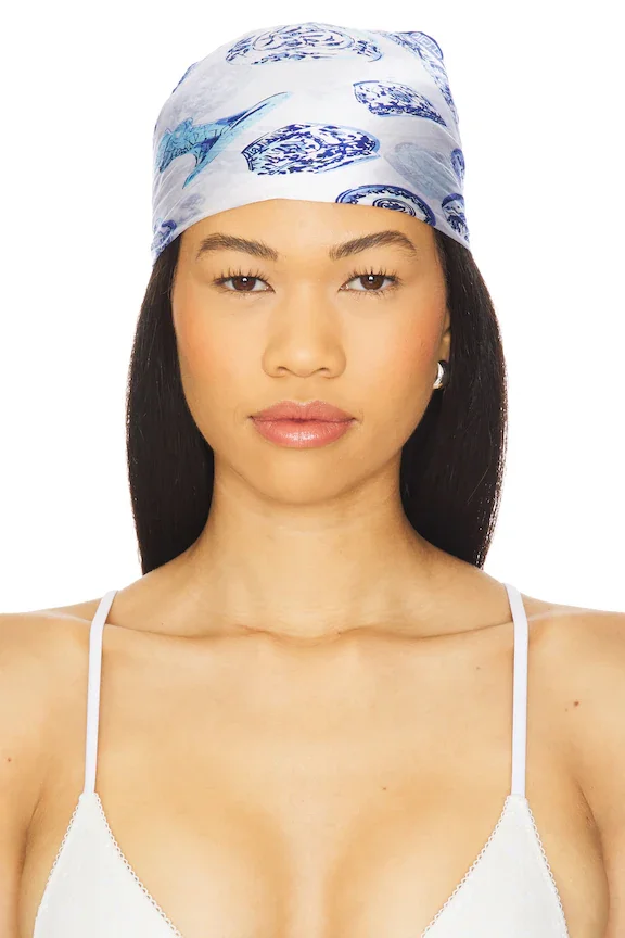
The last selection includes pieces that can be treated as more than a traditional scarf. The Etro Paisley Degradé Silk Poncho Top is named as a poncho top, while the Lisa Yang Brushed Cashmere Bandana Scarf points to a bandana shape. The ARAKII Exclusive Ruffled Wool Knit Scarf adds a ruffled detail in its name, and the Burberry Cashmere Embroidered EKD Scarf names embroidery. I would style one of these with a plain base for a gallery visit or a relaxed dinner, choosing the piece for the amount of texture I want. A blue scarf can be the quiet connecting color when the outfit has several neutrals. If the knit or embroidery is already prominent, I would skip a second decorative layer. Let one texture lead, and the look stays easy to wear.
Let Color Settle
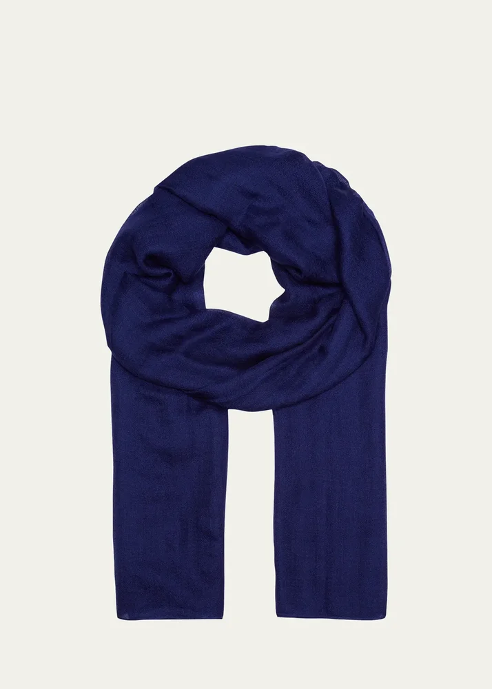
I reach for a blue scarf when an outfit needs a little color but not a full reset. Decide whether you want a narrow accent, a printed silk piece, or a warmer layer, then keep nearby patterns under control. For a busy day, a simple knot is practical; for an unhurried plan, a loose drape can feel more relaxed. I would skip overthinking the match and let the scarf sit naturally against the rest of the outfit. A single clear color note is often all I need.