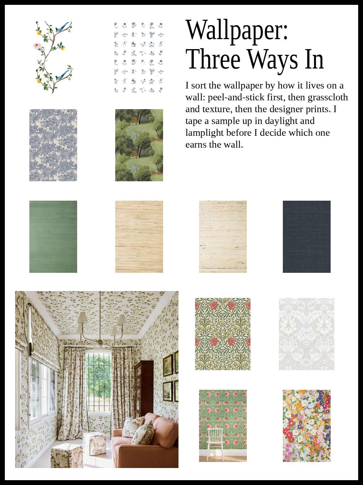
Wallpaper is easier to shop by type than by print, so this edit sorts peel-and-stick, grasscloth and textured, and designer prints by how they live on a wall. I say when I would reach for each kind and what to test before you commit.

Wallpaper: Peel-and-Stick, Grasscloth and Designer Prints, Sorted by Type
The V&A says William Morris produced over 50 wallpapers in his career, and the first one he designed was Trellis, in 1862, a pattern suggested by the rose trellis in the garden of Red House, his home in Kent. The museum adds that he set out to design his own because he could not find any that he liked well enough to use at home. I love that. A whole body of work began with one fussy man and his walls.
That fussiness is how I like to shop wallpaper: by type first, print second. There are three kinds here, peel-and-stick, grasscloth and textured, and designer prints, and each one answers a different question about your wall. Everything is sold by the roll or the panel, so I read the coverage on each listing and plan my own wall before I fall for anything.
Peel-and-stick is the low-commitment way in, and the first eight are all that. Rifle Paper Co.'s Juniper Forest is the one I would put behind a bed. Erin & Ben Co.'s Sparrow and Oak and Pluma bring a clear pattern to a powder room or short hallway. Jeremiah Brent's Collector's Study and Antique Arras give a small wall two different ways to hold pattern. For quieter walls, the Lily Pad, the Old World Trees in soft grayscale and the ecru and brown Charles Street Stripe do the job. My tip: stick a short strip in a corner for a day before you commit the whole wall.
Peel-and-stick wallpaper
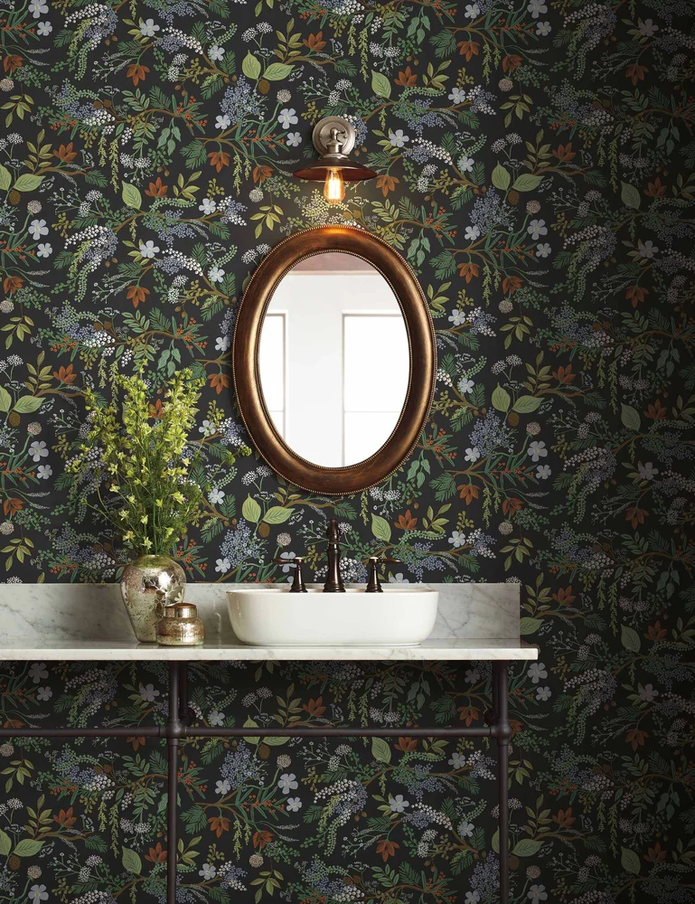
Juniper Forest Premium Peel + Stick Wallpaper
Rifle Paper Co.
$52.50
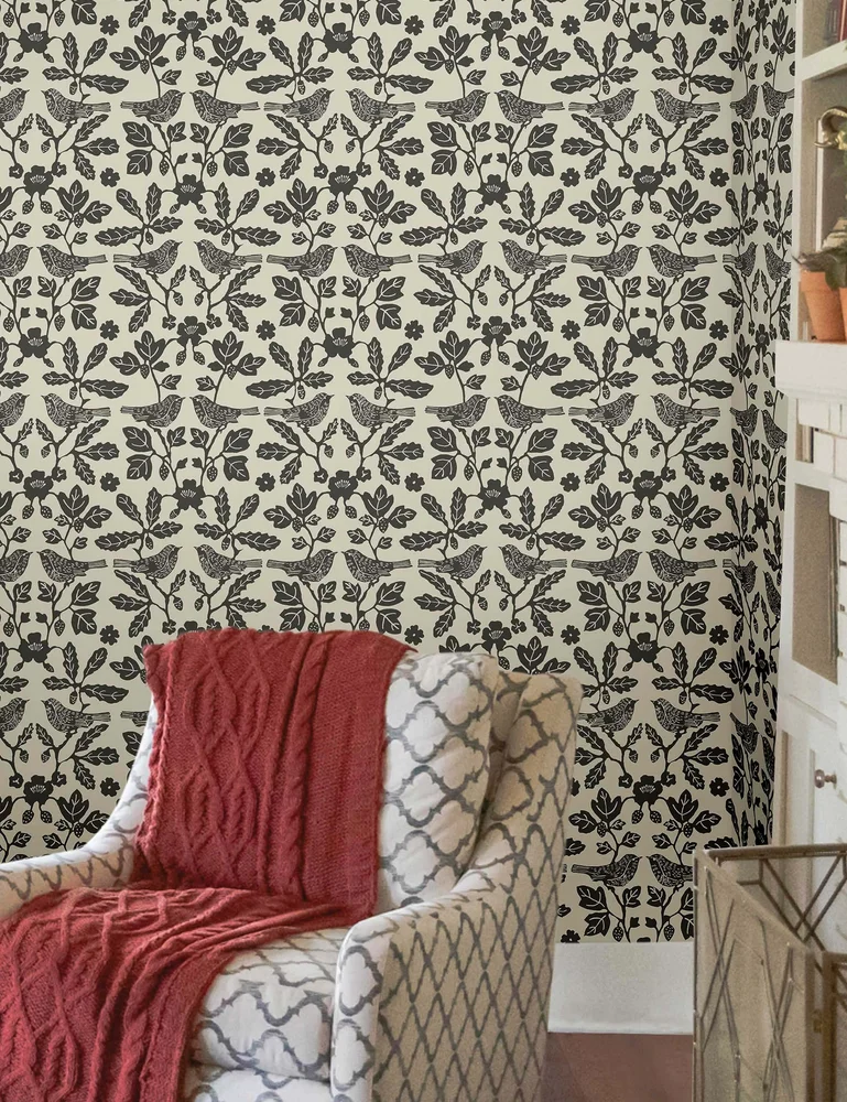
Sparrow and Oak Peel + Stick Wallpaper
Erin & Ben Co.
$70
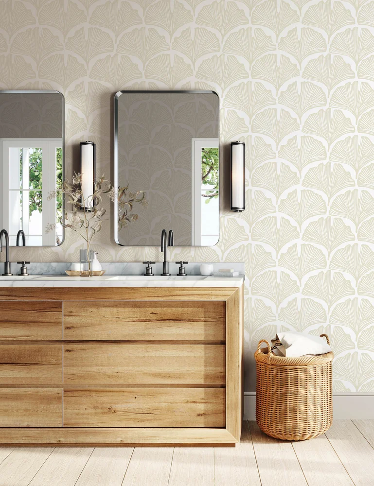
Pluma Peel + Stick Wallpaper
Lulu and Georgia
$48.75
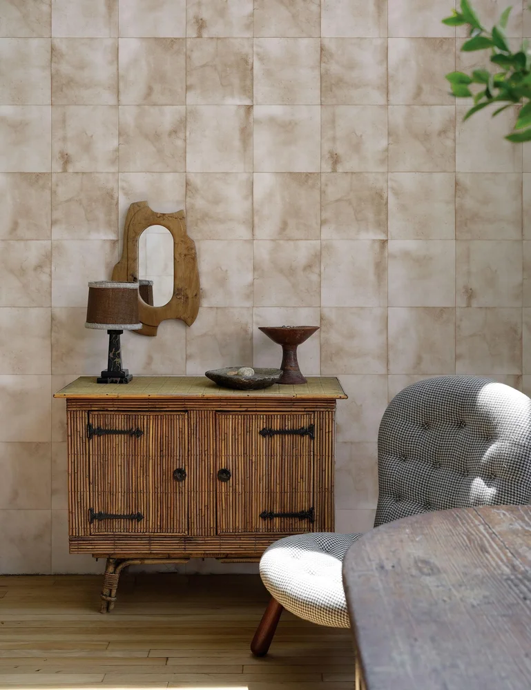
The Collector's Study Peel + Stick Wallpaper
Jeremiah Brent
$150
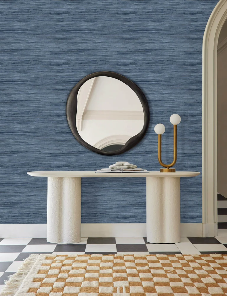
Bahiagrass Premium Peel + Stick Wallpaper
Lulu and Georgia
$52.50
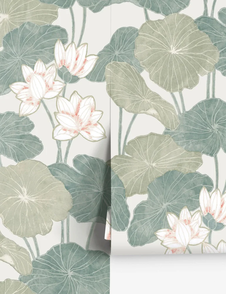
Lily Pad Peel + Stick Wallpaper
Lulu and Georgia
$47
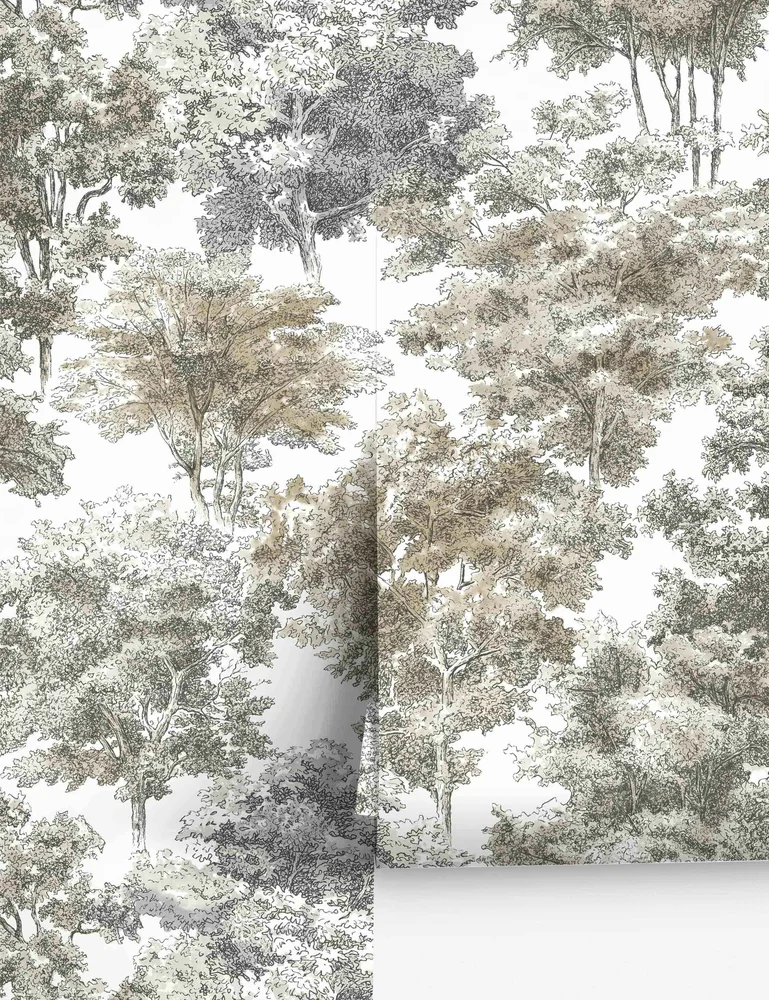
Old World Trees Peel + Stick Wallpaper
Lulu and Georgia
$47
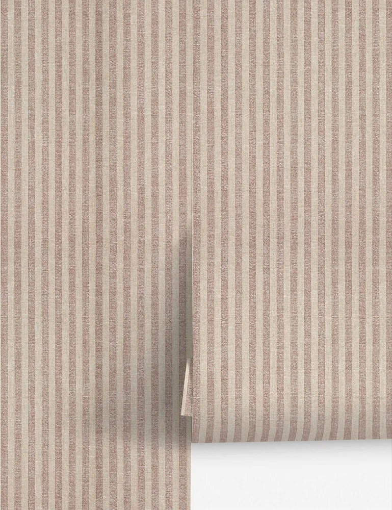
Charles Street Stripe Textured Peel + Stick Wallpaper
Jeremiah Brent
$65
Grasscloth, touched before chosen
Run your palm over a wall before you choose a color, because grasscloth is mostly about what your hand tells you. These are all woven or fiber-look papers, and the texture does half the decorating for you.
The plain ones are the easiest place to begin. Sarah Sherman Samuel's Tiger Grasscloth, Nathan Turner's Persimmon Birds, and Carnegie Stripe make texture the point. The Beale in cream is a clean woven texture, while Pure Salt's Faux Roman Clay would be my pick for a study with brass lamps.
If you want a pattern, the Sarah Sherman Samuel Winona has sketch-like blue line florals over a tan woven ground, and the Kirby is a chocolate brown and cream stripe-and-dot motif. The Tessier is a printed faux version with an oatmeal woven-fiber look, which is a simpler idea for anyone who likes the look but not the fuss.
Before you order, ask for a sample and tape it up in daylight and lamplight. Seams can show on natural fibers, and that is part of the charm, so decide if you like it first.
What I would skip: a dark sisal in a room with one small window.
Grasscloth and textured wallpaper
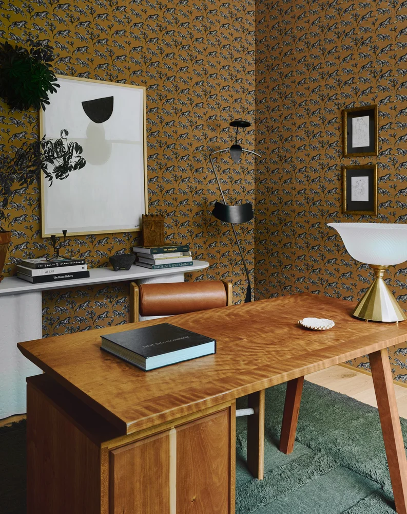
Tiger Grasscloth Wallpaper
Sarah Sherman Samuel
$411
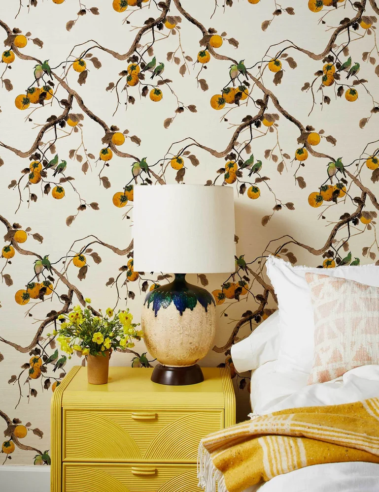
Persimmon Birds Grasscloth Wallpaper
Nathan Turner
$356.25
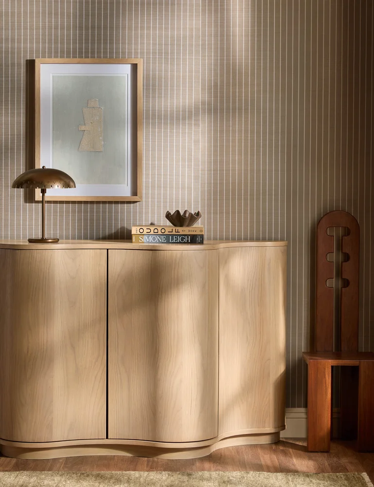
Carnegie Stripe Grasscloth Wallpaper
Lulu and Georgia
$411
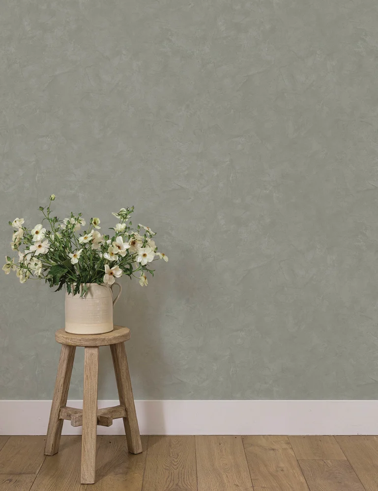
Faux Roman Clay Peel + Stick Wallpaper
Pure Salt
$112.50
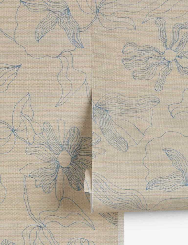
Winona Grasscloth Wallpaper
Sarah Sherman Samuel
$548
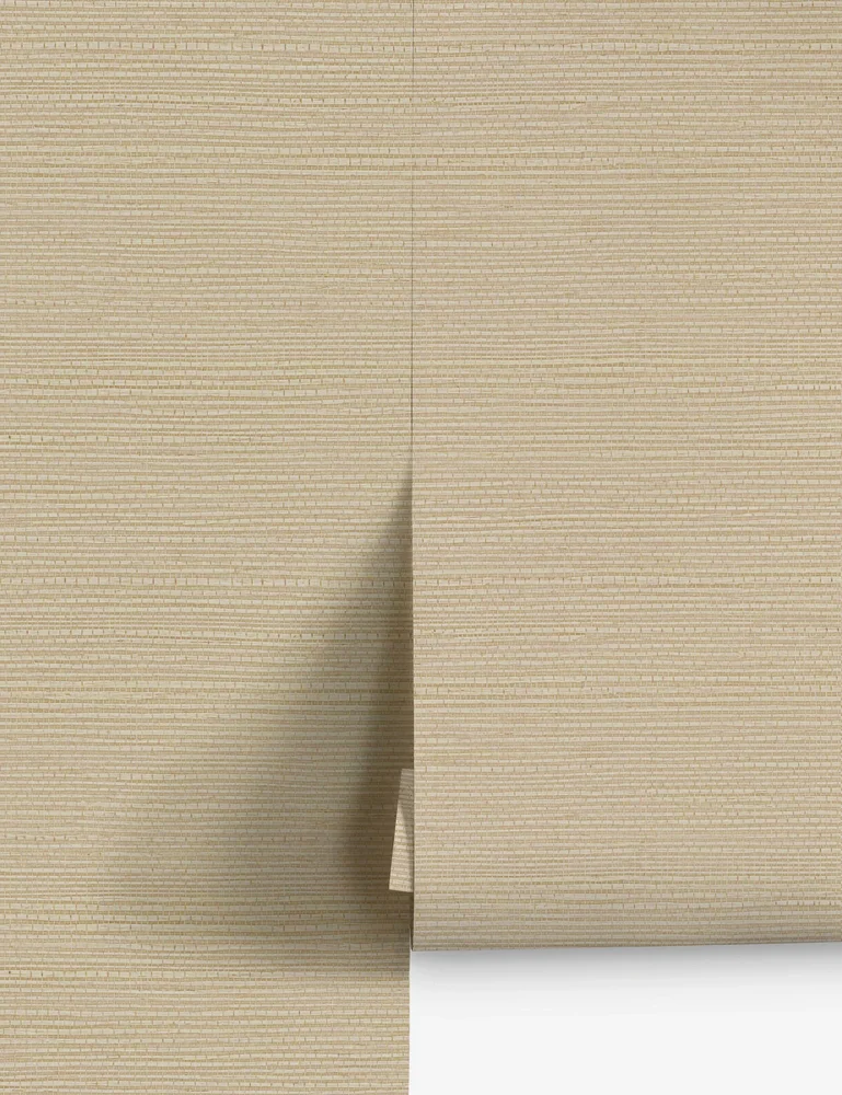
Beale Grasscloth Wallpaper
Lulu and Georgia
$378
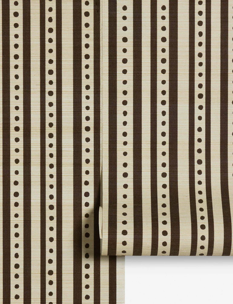
Kirby Grasscloth Wallpaper
Lulu and Georgia
$548
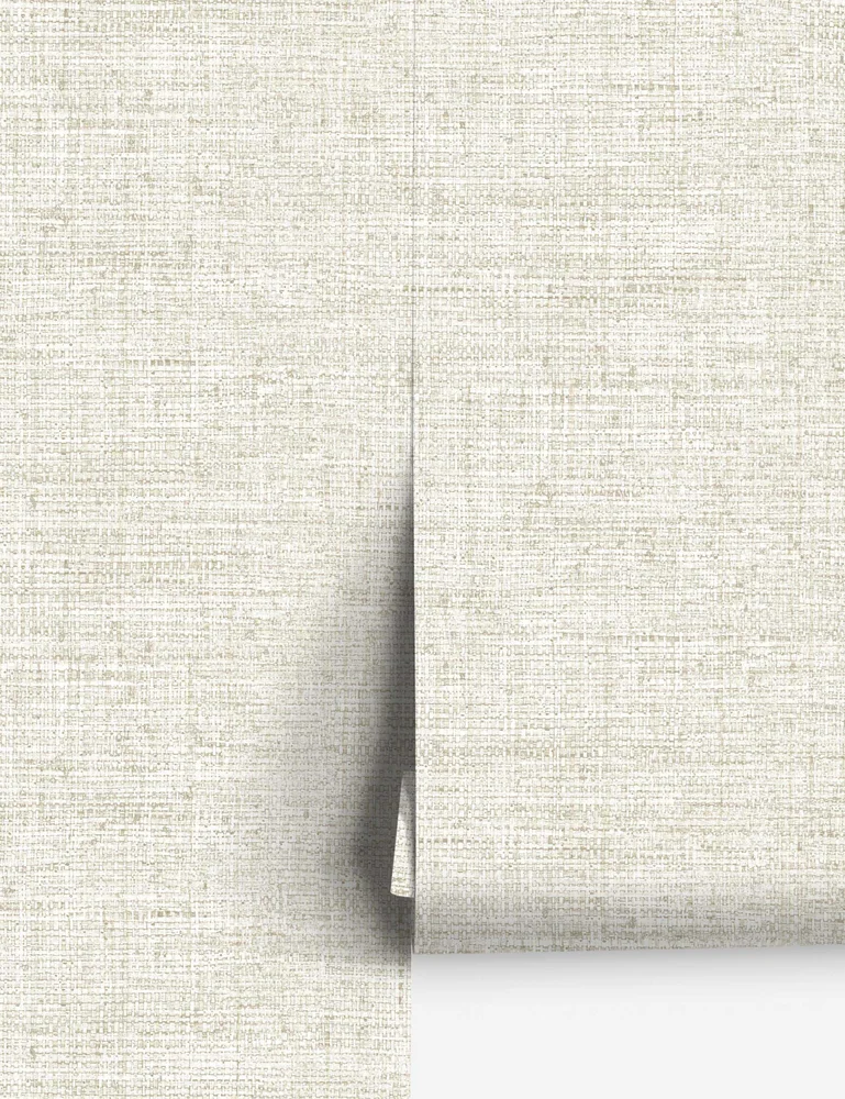
Tessier Faux Grasscloth Wallpaper
Lulu and Georgia
$128
Designer prints, by scale
Pattern scale is the first thing I check on a designer paper, because a print that looks calm on a screen can take over a small room. Hold the sample against the wall you actually have and step back across the room.
The Morris & Co. trio makes a good study. The Oxford Union is a symmetrical Arts and Crafts floral with coral-red blooms and green leaves on cream. The Myrtle is a dove-gray tone-on-tone woodland floral adapted from a William Morris embroidery design, which makes it the easy one for a bedroom. Pure Honeysuckle & Tulip by Morris & Co. gives the trio another floral direction. The first two are paste-the-wall and pre-trimmed, which makes hanging them more forgiving.
House of Hackney began in 2011, dreamed up in a London townhouse by Frieda Gormley and Javvy M Royle, and Sanderson's Wildflower Meadow adds an expressive print to the grid.
Lina Schnaufer's Taget mural makes a statement at room scale. The Scalamandre Linnea by Sandberg, in misty blue and cream, and the Fig Garden, a muted green with fig, grape and pea vine, are the leafier pair. Sanderson's Silver Lime adds a calmer note to the print mix.
Designer print wallpaper
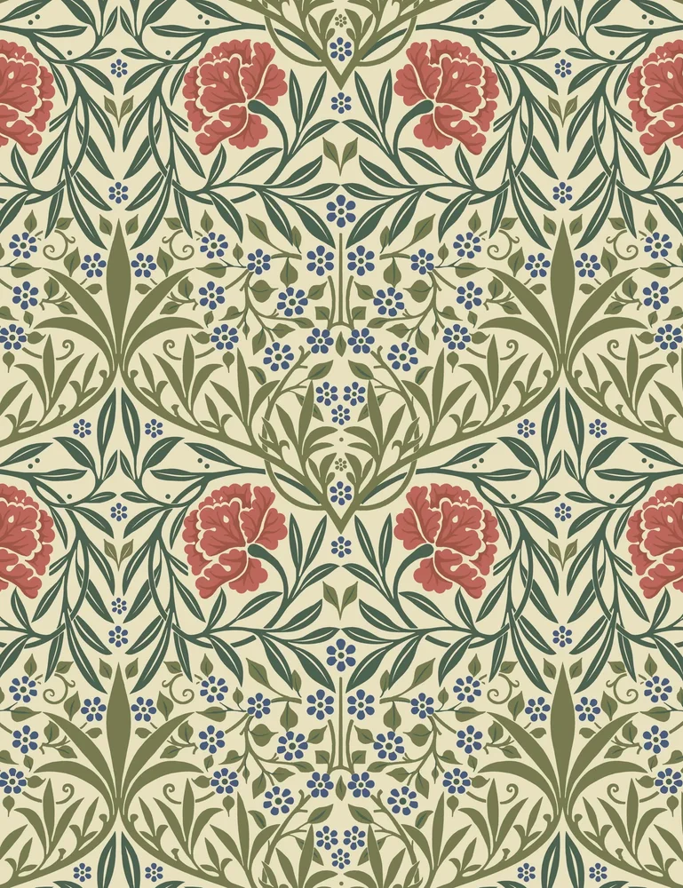
Oxford Union Wallpaper
Morris & Co.
$180
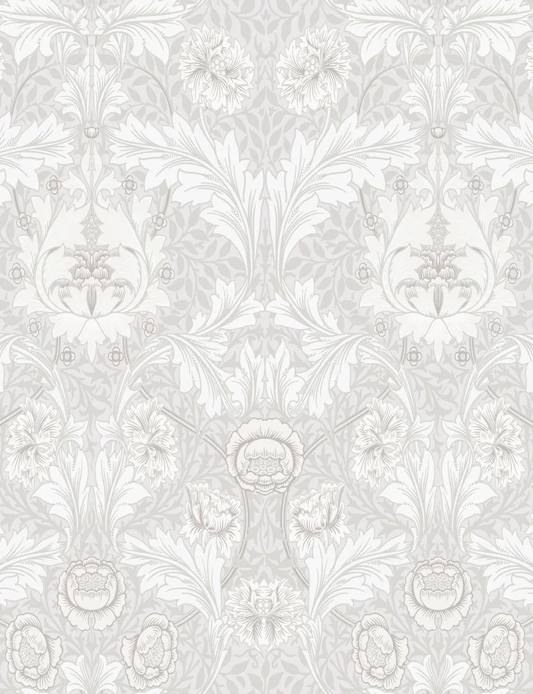
Myrtle Wallpaper
Morris & Co.
$180
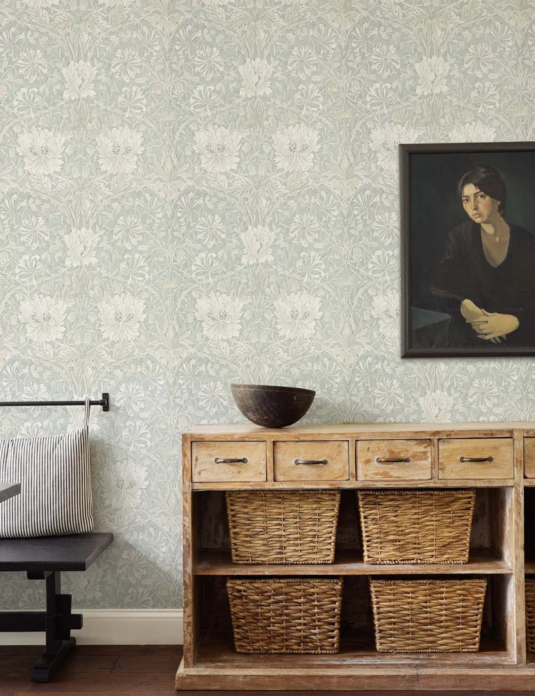
Pure Honeysuckle & Tulip Wallpaper
Morris & Co.
$404
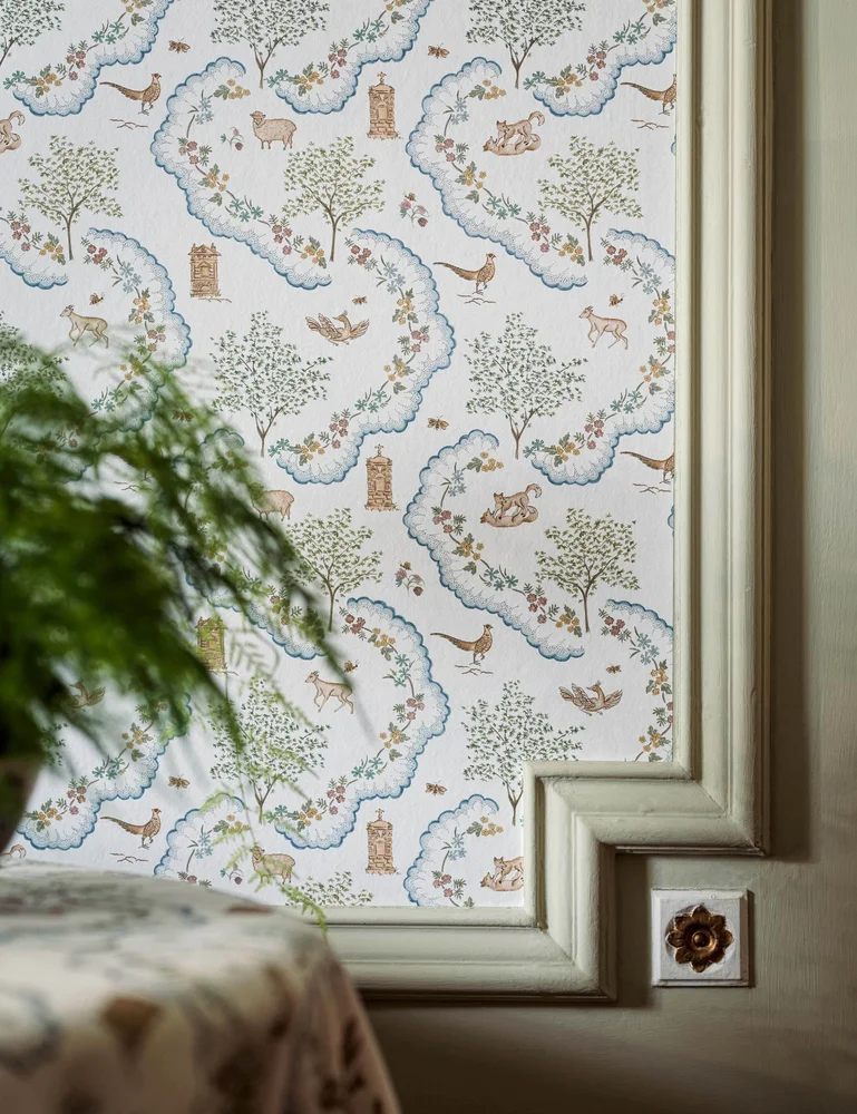
Wildflower Meadow Wallpaper
Sanderson
$416
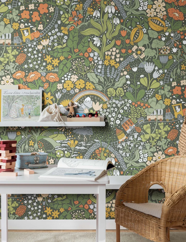
Taget Wallpaper Mural
Lina Schnaufer
$261
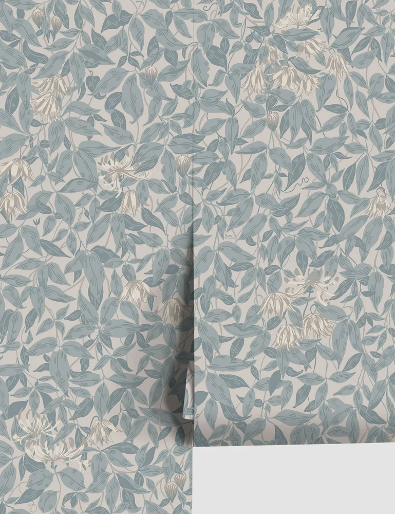
Linnea Wallpaper by Sandberg, Misty Blue
Scalamandre
$173
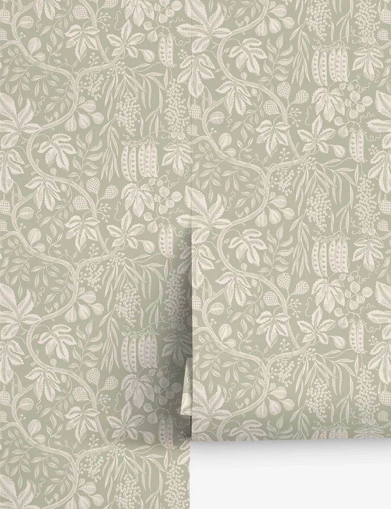
Fig Garden Wallpaper
Scalamandre
$173
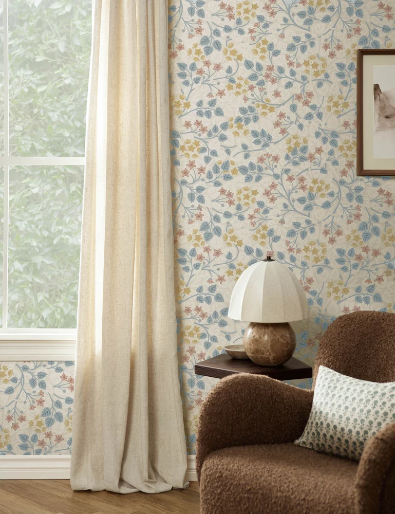
Silver Lime Wallpaper
Sanderson
$326
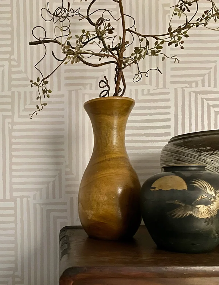
Sassaman Peel + Stick Wallpaper
Lulu and Georgia
$48
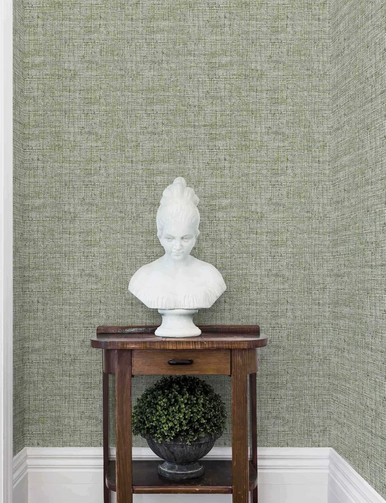
Papyrus Faux Grasscloth Peel + Stick Wallpaper
Lulu and Georgia
$58.50
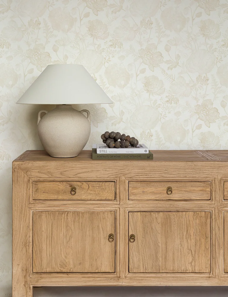
Poppies Textured Peel + Stick Wallpaper
Pure Salt
$48.75
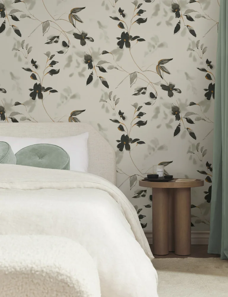
Linden Flower Premium Peel + Stick Wallpaper
Lulu and Georgia
$48.75
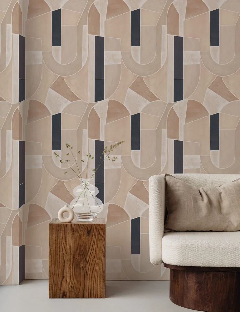
Meet Me in Peru Textured Peel + Stick Wallpaper
Jeremiah Brent
$48.75
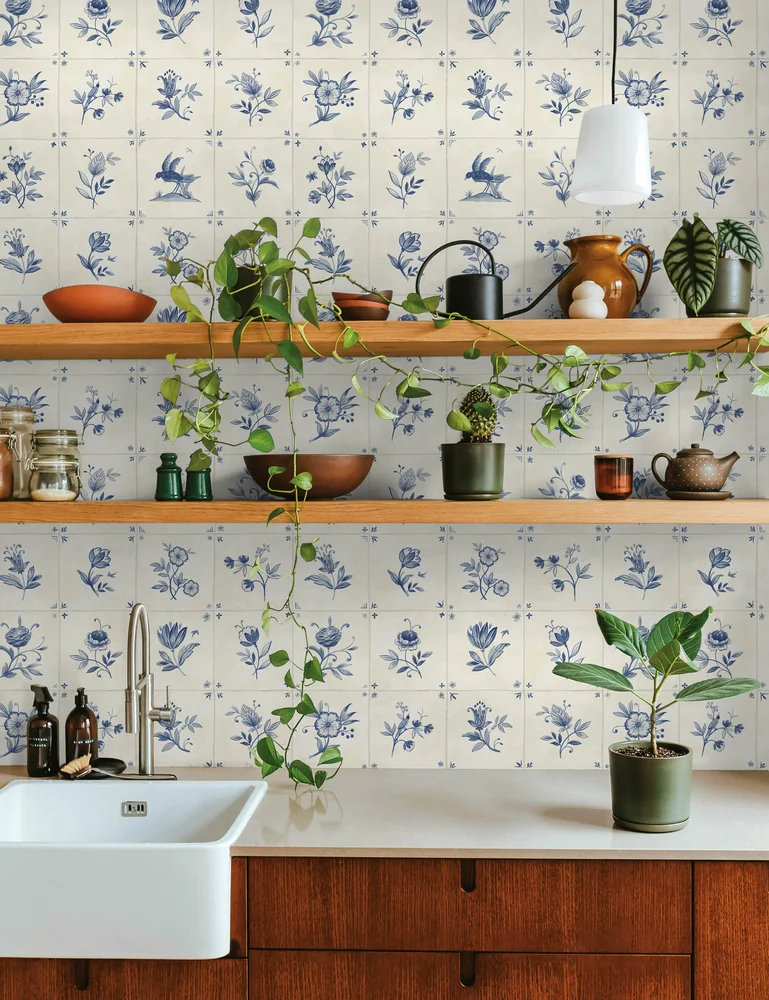
Azulejo Tile Textured Peel + Stick Wallpaper
Lulu and Georgia
$48.75
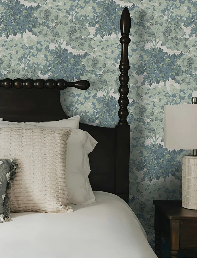
Breeland Faux Grasscloth Peel + Stick Wallpaper
Lulu and Georgia
$48.75
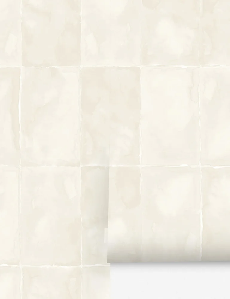
Aries Wallpaper
Lulu and Georgia
$125
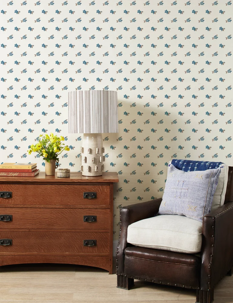
Anna Floral Grasscloth Wallpaper
Nathan Turner
$371.25
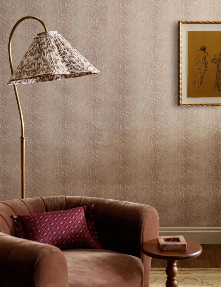
Deer Grasscloth Wallpaper
Nathan Turner
$371.25
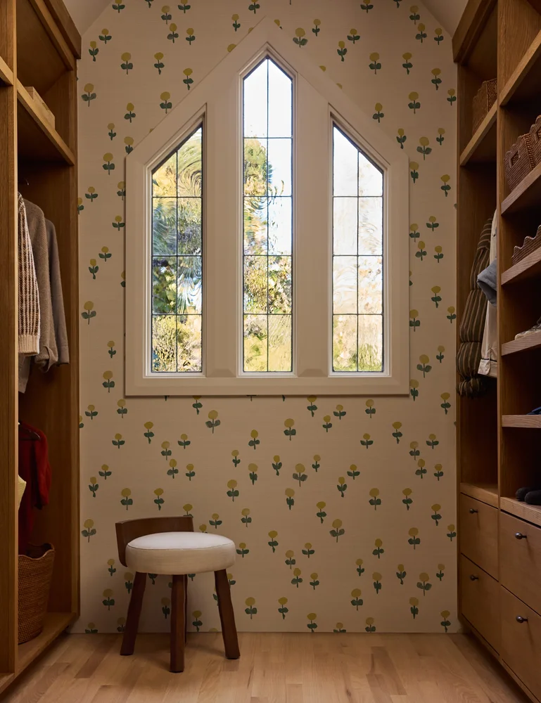
Voi Grasscloth Wallpaper
Sarah Sherman Samuel
$411
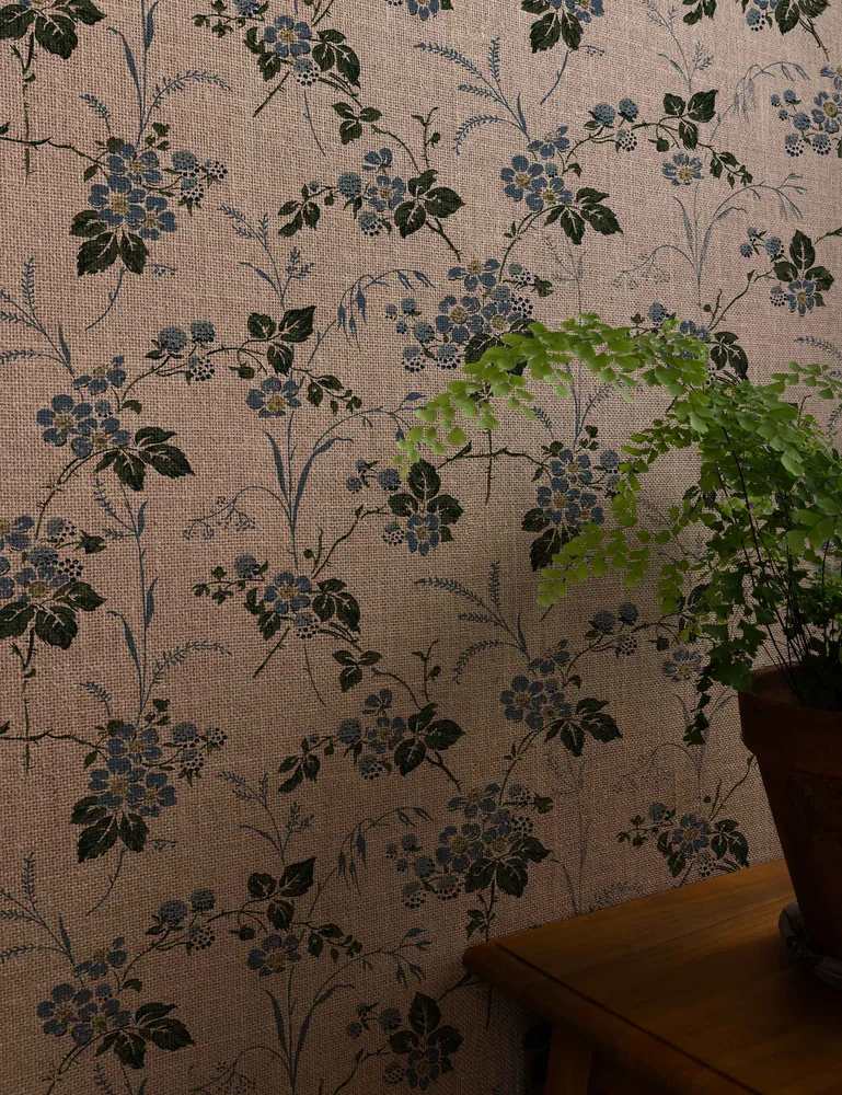
Heaton Burlap Wallpaper
Nathan Turner
$371.25
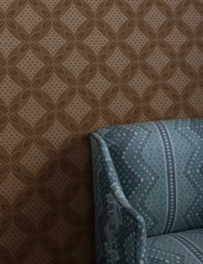
Arthur Burlap Wallpaper
Nathan Turner
$371.25
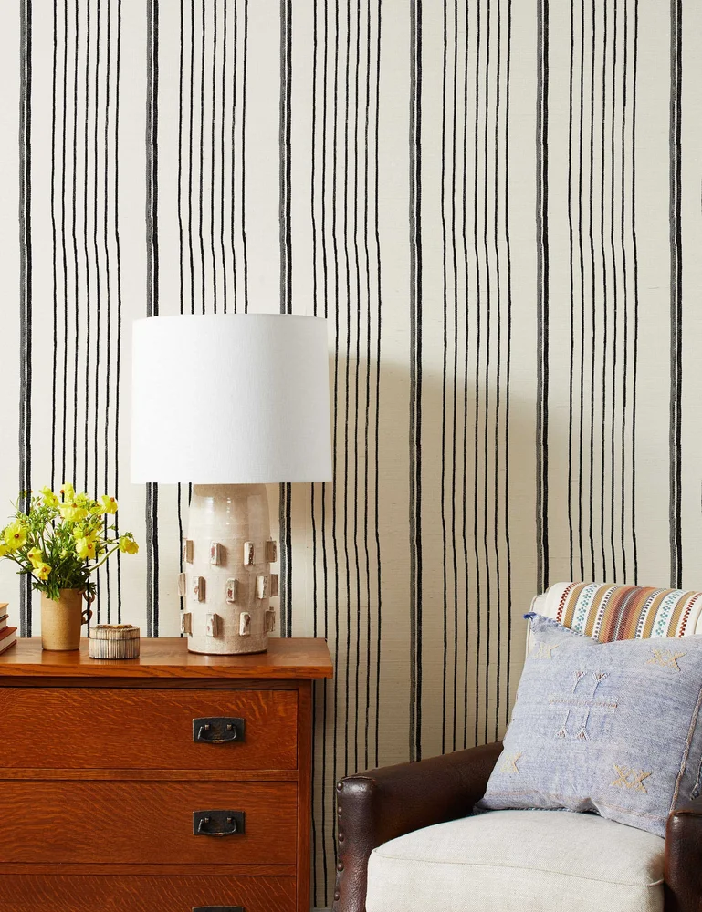
Two Tone Stripe Grasscloth Wallpaper
Nathan Turner
$356.25
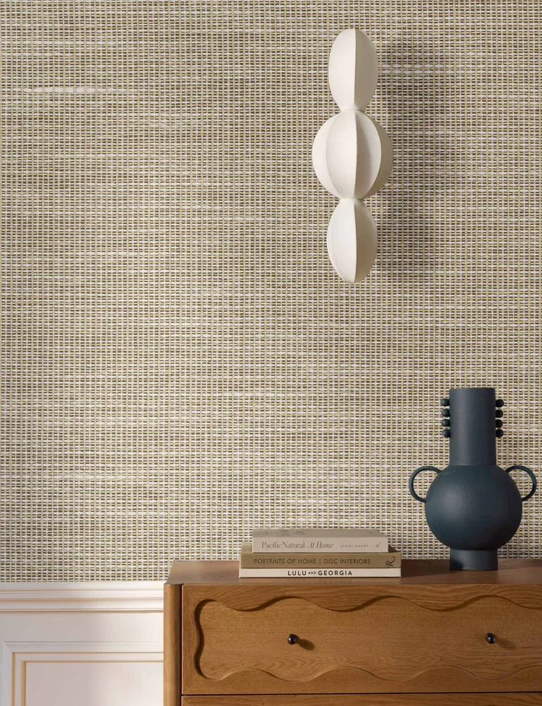
Moyer Wallpaper
Lulu and Georgia
$411
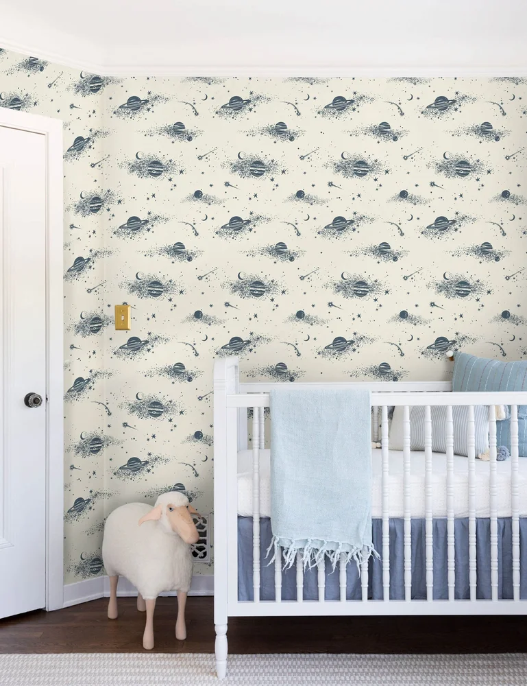
Cassiopeia Wallpaper
Lulu and Georgia
$79.20
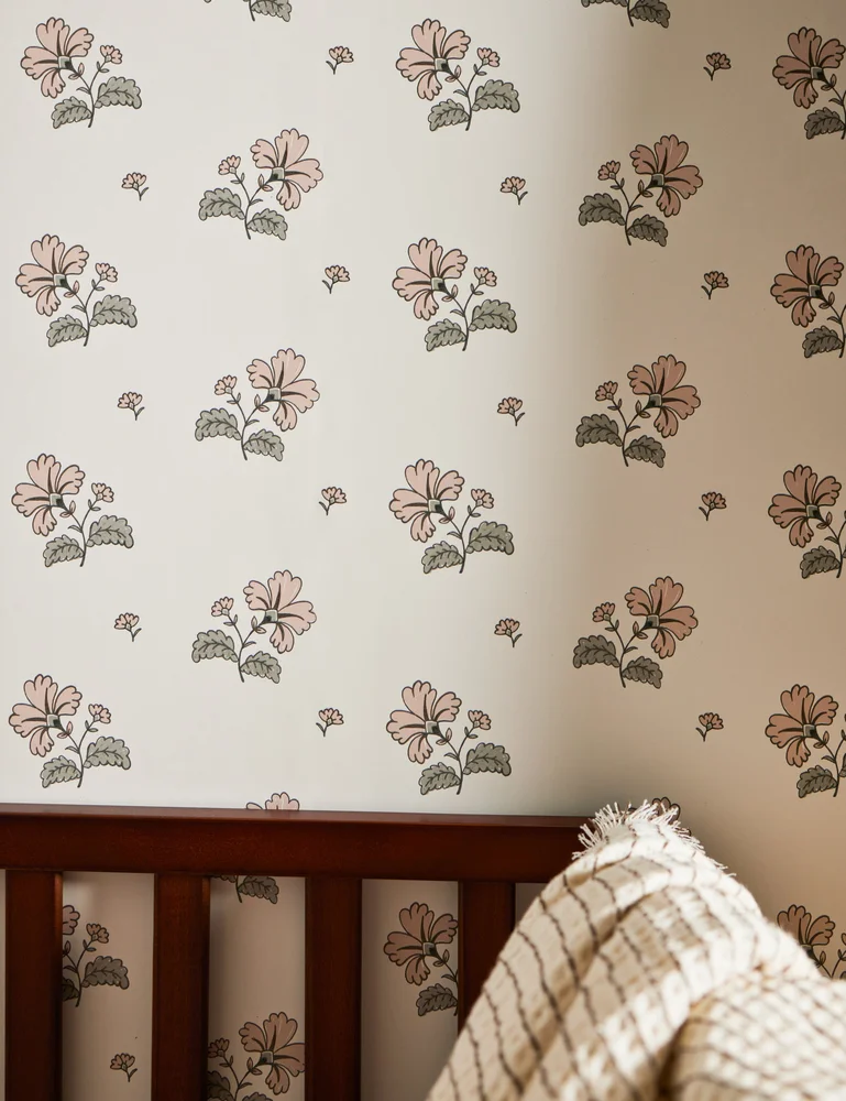
Vintage Floral Wallpaper
Rylee + Cru
$148.50
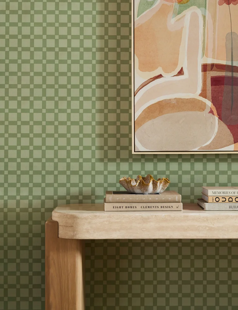
Janae Checkered Wallpaper
Lulu and Georgia
$103.60
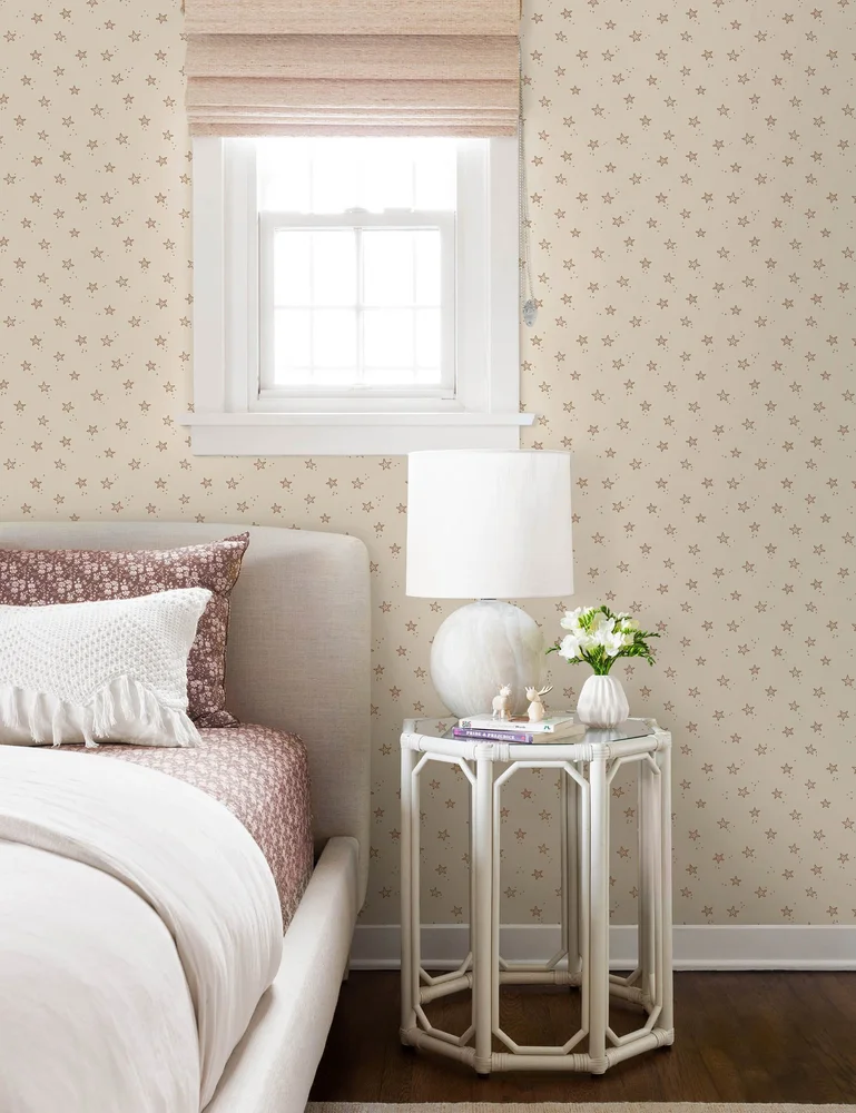
Starfish Wallpaper
Rylee + Cru
$62
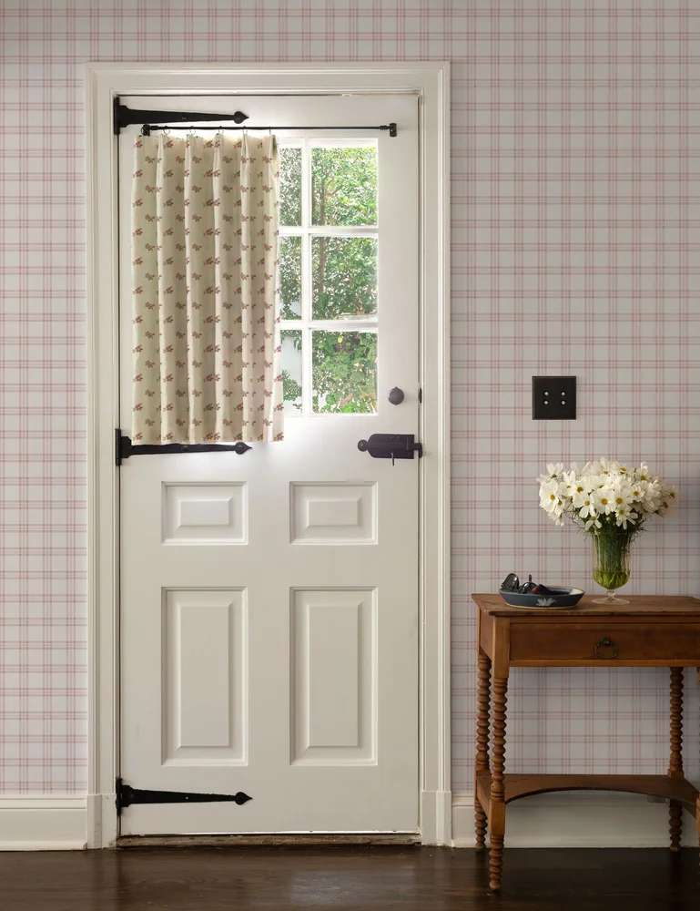
Rogers Plaid Wallpaper
Nathan Turner
$223.50
Choosing from the wall out
I would begin with the wall, not the roll. Decide whether you want something you can peel off, something your hand will notice, or something with a name behind it, and that decides the section you shop.
Then I would order a sample of my top two, tape them up and look at them over a week. Check the repeat, the seams and the light at dusk.
Morris could not find a wall he liked, so he made one. I would hold myself to the same standard and keep looking until one makes me smile when I flip the switch.